An image generation model by xAI designed to generate highly aesthetic images from text descriptions.
Settled by community votes across 16 shared challenges, with an AI judge weighing in on each.
Grok Imagine Image
24.1
arena score
#19 of 44 in Text-to-Image
Skill signature
Not enough comparable category data
The chart appears once both models have ratings across at least three shared arena categories.
Grok Imagine Image Pro
24.8
arena score
#14 of 44 in Text-to-Image
Vote tally
Where the votes landed
Grok Imagine Image
15.8%
win rate
Ties
5.3%
Grok Imagine Image Pro
78.9%
win rate
15.8%
5.3% ties
78.9%
Shared challenges
16
Challenge by challenge
The strongest take from each model on every shared challenge, with the AI judge's read.
Geometric Composition
Text-to-Image“A glass cube on a wooden table. Inside the cube is a small blue sphere. On top of the cube sits a red book. A green plant is behind the cube, partially visible through the glass. Soft window light from the left.”
Grok Imagine Image
Grok Imagine Image Pro
0% wins
0% ties
100% wins
AI Judge Analysis
Grok Imagine Image
- + Excellent photographic realism and lighting
- + Captures the interaction of the plant behind the glass very naturally
- + Creative suspended effect for the sphere
- − The sphere appears to be floating mid-air inside the cube without support
- − The glass cube has slightly rounded/pill-shaped corners rather than being a sharp cube
Grok Imagine Image Pro
- + Strong adherence to spatial instructions with the sphere resting on the bottom
- + High quality texture on the book and table
- + Accurate rendering of light entering from the left
- − The plant is mostly above/behind the book rather than visible through the glass as requested
- − Minor distortion artifacts in the reflections on the glass
Verdict: Both models followed the prompt closely, but Grok Imagine (Image A) creates a more aesthetically pleasing, cinematic image with superior lighting and transparency. While Grok Imagine Pro (Image B) is more grounded in physics by placing the sphere on the bottom of the cube, it fails to show the plant visible through the glass as clearly as Grok Imagine.
Candid Street Photography
Text-to-Image“A candid street photo of an elderly Japanese man repairing a red bicycle in light rain, reflections on wet pavement, shallow depth of field, 50mm lens, natural skin texture, imperfect framing, motion blur from passing cars, cinematic but realistic, no stylization.”
Grok Imagine Image
Grok Imagine Image Pro
0% wins
0% ties
100% wins
AI Judge Analysis
Grok Imagine Image
- + Excellent adherence to the 'motion blur from passing cars' prompt requirement.
- + Very realistic, unpolished 'candid' feel with imperfect framing.
- + Accurate medium format/film-like depth of field.
- − The subject's face is largely hidden and the lighting is quite dark.
- − The bicycle details are somewhat muddy compared to Model B.
Grok Imagine Image Pro
- + Superior detail on the man's face and the mechanical parts of the bicycle.
- + Great rendering of the wet pavement and rain droplets.
- + Composition is clear and well-balanced while still feeling candid.
- − Failed to include motion blur for the cars as specifically requested.
- − The lighting feels slightly more 'rendered' and less like a true candid snapshot.
Verdict: Grok Imagine (Model A) followed the technical prompt instructions more closely, particularly regarding the motion blur of passing cars and the 'imperfect framing' of a candid street photo. Grok Imagine Pro (Model B) produced a much more pleasing and detailed image with better clarity on the subject's face, but missed the specific request for motion blur. Model A feels like a genuine accidental photo, while Model B feels like a high-end commercial photograph.
Fantasy Warrior
Text-to-Image“Close portrait of a battle-worn paladin in ornate engraved plate armor, hair braided with small beads, faint scars and dirt on the skin, warm torchlight reflecting off metal, shallow depth of field, bokeh sparks, lifelike eyes, highly detailed texture on leather straps and cloth underlayer.”
Grok Imagine Image
Grok Imagine Image Pro
0% wins
0% ties
100% wins
AI Judge Analysis
Grok Imagine Image
- + Exquisite engraving detail on the plate armor
- + Beautiful atmospheric lighting with soft bokeh
- + Natural and realistic facial features
- − The character looks more like a fashion model than a 'battle-worn' warrior
- − The hair beads are very subtle and blend into the hair
Grok Imagine Image Pro
- + Excellent adherence to 'battle-worn' with grit, rust, and visible scarring
- + Extremely detailed leather straps and textured cloth underlayer
- + Impressive text rendering on the gorget and distinct hair beads
- − The lighting on the face feels slightly flatter compared to Model A
- − The facial expression is a bit stiff
Verdict: Both models followed the prompt exceptionally well, but Grok Imagine Image Pro (Model B) captured the gritty 'battle-worn' aesthetic much more effectively through the use of rust on the armor and realistic skin texture. While Model A produced a more classically beautiful image with stunning armor engravings, Model B excelled in providing the specific details requested like the leather straps, cloth layers, and clear hair beads.
Modern Clean Menu
Text-to-Image“Modern minimalist restaurant menu design, white background with colorful food photos in grid, sections for appetizers/pizza/mains, bold sans-serif fonts, vibrant accents, clean professional layout for casual dining.”
Grok Imagine Image
Grok Imagine Image Pro
0% wins
0% ties
100% wins
AI Judge Analysis
Grok Imagine Image
- + Includes specific item names and descriptions, making it look like a functional menu.
- + Uses a varied layout with text and circular food images for a professional feel.
- + Correctly categorizes specific dishes under the appropriate headers.
- − Considerable amount of illegible 'lorem ipsum' style text in descriptions.
- − The layout is a bit cluttered and does not strictly follow a 'grid' for photos as requested.
- − Repeats the same item names (e.g., Steak Frites, Grilled Salmon) multiple times.
Grok Imagine Image Pro
- + Perfectly hits the 'grid' requirement with a clean 3x3 layout.
- + Images of the food items are exceptionally high quality, clear, and vibrant.
- + Strictly minimalist and modern aesthetic that aligns well with the prompt's simplicity.
- − Lacks specific item names or descriptions, acting more like a gallery than a full menu.
- − The headers are very small and isolated from the actual content.
- − Very basic design with no text variety beyond section titles.
Verdict: Grok Imagine Image creates a more functional menu design with actual item names and descriptions, though the text becomes garbled and repetitive. Grok Imagine Image Pro interprets the 'grid' prompt more literally and provides much higher quality food photography, but fails to include the standard textual elements expected in a menu. Grok Imagine Image is preferred for overall design coherence as a menu, even with its text flaws.
Chalkboard Menu
Text-to-Image“Handwritten-style chalkboard menu in a cozy café, all text rendered in the exact same realistic chalk handwriting style with natural variations in letter size, slight slant, and chalk texture — no printed or digital fonts anywhere on the board. Title at the top in elegant cursive chalk handwriting: ‘TODAY’S SPECIALS – APRIL 30, 2026’. Below it, three menu items also in the same handwritten chalk style: ‘Truffle Mushroom Risotto – $24’, ‘Grilled Octopus with Lemon & Herbs – $28’, ‘Brown Butter Chocolate Chip Cookies – $9’. At the very bottom, smaller text in the identical handwritten chalk style (slightly smaller but still clearly legible with the same handwriting characteristics): ‘All items made fresh daily • Ask about our gluten-free options’. Warm ambient café lighting, visible chalk dust and smudges, realistic handwriting imperfections, no clean printed text anywhere.”
Grok Imagine Image
Grok Imagine Image Pro
AI Judge Analysis
Grok Imagine Image
- + Excellent chalk texture throughout the board
- + Natural-looking smudges and erasing marks add to the realism
- + Large, readable text with consistent character styling
- − The date 'April 30, 2026' is in print rather than the requested elegant cursive
- − The '2' in '24' has a slight artifact where the line breaks
Grok Imagine Image Pro
- + Successfully rendered most items with cursive elements
- + Very clean framing and composition with the wooden border
- + Excellent spelling and adherence to the character names and prices
- − The title is in a blocky print style rather than the requested elegant cursive
- − The lettering looks slightly more digital/font-like compared to the raw texture of Model A
Verdict: Both models followed the complex text prompt remarkably well, but Grok Imagine Image (Model A) feels more like a real chalkboard due to the authentic chalk dust and smudging textures. While Grok Imagine Image Pro (Model B) provided a cleaner layout, Model A captured the 'handwritten-style' request with more convincing natural variations and chalk physics.
Pose & Character Mashup
EditingEdit instruction
“Use Image 1 as the exact pose reference and Image 2 as the character reference. Recreate the person/character from Image 2 in the exact dynamic pose and body position from Image 1. Keep the exact face, hair, clothing style/details, and expression from Image 2. Match the lighting and environment of Image 1. The final image must show the character from Image 2 performing the precise action/pose from Image 1 with perfect anatomy and natural integration.”
Source
Grok Imagine Image
Grok Imagine Image Pro
AI Judge Analysis
Grok Imagine Image
- + Perfectly preserves the source Image 1
- − Completely failed to perform any edit or character replacement
- − Ignored the character reference in Image 2 entirely
Grok Imagine Image Pro
- + Perfectly preserves the source Image 1 pose and environment
- − Failed to replace the character with the man from Image 2
- − Modified the woman's face and hair slightly but ignored the character identity requested
- − Added a hoodie string that wasn't in original but didn't follow prompt
Verdict: Both Grok Imagine and Grok Imagine Pro failed significantly on this complex image editing task. Both models returned the original Image 1 with almost no changes; Grok Imagine Pro performed a slight facial and hair modification on the existing female subject but completely ignored the instruction to use the male character from Image 2.
Outfit Transfer Challenge
EditingEdit instruction
“Use Image 1 as the base person. Dress them in the exact elaborate outfit from Image 2 (including all layers, accessories, jewelry, and shoes). Carefully adapt the clothing to the body shape and pose in Image 1 while maintaining realistic fabric behavior, correct proportions, and perfect lighting/shadow matching. Keep the person’s exact face, hair, and background completely unchanged.”
Source
Grok Imagine Image
Grok Imagine Image Pro
AI Judge Analysis
Grok Imagine Image
- + Excellent preservation of the subject's skin texture and vitiligo patterns on the hands.
- + High level of detail in the embroidered royal garments.
- + Matches lighting and shadows of the beach environment flawlessly.
- − Completely failed to use the specific outfit from Image 2 (coat/scarf/jeans).
- − The hand holding the belt looks slightly distorted/artificial.
Grok Imagine Image Pro
- + Successfully preserved the subject's facial features and hair pattern.
- + Strong technical quality with clean lines and high-end fabric textures.
- + Good integration of jewelry and layering.
- − Completely failed to use the specific outfit from Image 2 (coat/scarf/jeans).
- − The skin on the hands does not match the subject's face/arms, missing the vitiligo pattern and appearing as a different skin tone.
- − The right hand has anatomical issues with six finger-like segments.
Verdict: Both models completely failed the primary instruction of the editing task, which was to use the specific outfit from Image 2 (a modern pea coat, scarf, and jeans). Instead, both models generated generic 'elaborate' royal costumes. Grok Imagine Image is the winner because it successfully maintained the subject's unique skin characteristics (vitiligo) on the hands, whereas Grok Imagine Image Pro replaced them with generic hands that also featured anatomical errors.
The Capybara Taxi Driver
Text-to-Image“Photorealistic scene inside a yellow New York taxi at night. A capybara is driving, wearing a yellow taxi driver cap and a dark jacket. It has a calm, professional expression and both front paws on the steering wheel. In the back seat sits a human businesswoman in a coat, looking at her phone with a completely normal, bored expression (as if this is just another normal ride). Through the windows you can see the streets of Manhattan at night with blurred lights. Realistic taxi interior, photorealistic, detailed fur and fabric, 35mm lens, night lighting with reflections, shallow depth of field.”
Grok Imagine Image
Grok Imagine Image Pro
AI Judge Analysis
Grok Imagine Image
- + Excellent photorealism with smooth lighting
- + The woman sits correctly in the passenger side of the front seat, which aligns with the image's perspective even if seats differ
- + High detail on the capybara's fur and the jacket fabric
- − The woman appears to be in the front seat next to the driver, rather than the back seat as requested
- − The woman's hand rendering on the phone is slightly messy
- − The taxi cap is a generic yellow hat without text
Grok Imagine Image Pro
- + Accurately places the woman in the back seat as requested in the prompt
- + Impressive text rendering on the hat with 'NYC TLC Medallion'
- + The lighting and atmosphere capture the night Manhattan vibe perfectly
- − The woman's facial expressions and anatomy are slightly less sharp than Model A
- − The capybara's claws look a bit metallic/unnatural on the steering wheel
Verdict: Both models performed exceptionally well on the surreal request, but Grok Imagine Image Pro is the winner for correctly placing the businesswoman in the back seat, whereas Grok Imagine Image placed her in the front. Additionally, Grok Imagine Image Pro added highly relevant details like the 'TLC Medallion' text on the cap, which enhanced the realism of the scene.
Bald man challenge
Image EditingEdit instruction
“Give the person a full, thick head of natural hair with realistic texture, density, and a natural hairline. Preserve facial features and lighting.”
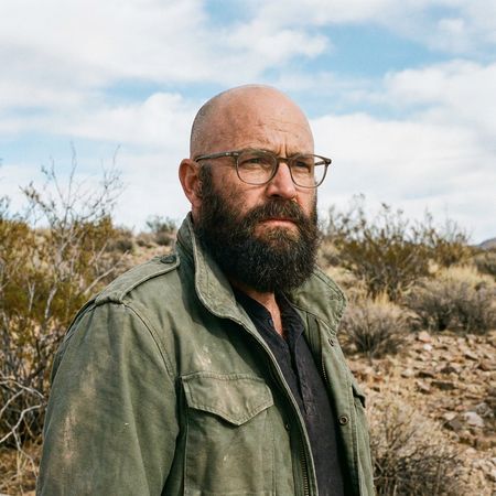
Grok Imagine Image
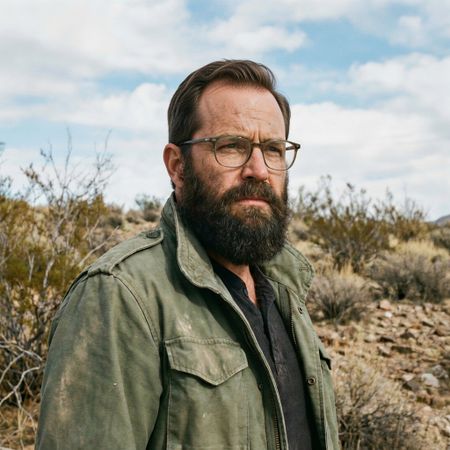
Grok Imagine Image Pro
0% wins
100% ties
0% wins
AI Judge Analysis
Grok Imagine Image
- + Natural hair texture and color
- + Perfectly preserves all original elements of the face, clothing, and background
- + Seamless blending at the hairline
- − The hairline is a bit low on the forehead
- − Slight lack of volume compared to the requested 'thick' head of hair
Grok Imagine Image Pro
- + Realistic hair volume and styling
- + Excellent preservation of the source image context and lighting
- + Matches the beard color and texture accurately
- − Small artifact where the hair meets the top of the glasses frame
- − Slightly less realistic hairline transition compared to Model A
Verdict: Both models performed excellently, perfectly preserving the source image's lighting, background, and facial features. Grok Imagine Image (Model A) provides a very natural, messy texture that blends seamlessly with the original scalp, while Grok Imagine Image Pro (Model B) offers a more styled, voluminous look that better fits the 'thick' part of the prompt despite a tiny artifact near the glasses.
Isometric Miniature Diorama Scenes
Text-to-Image“Create a clear, 45° top-down isometric miniature 3D cartoon scene of Japan's signature dish: sushi, with soft refined textures, realistic PBR materials, gentle lighting, on a small raised diorama base with minimal garnish and plate. Solid light blue background. At top-center: 'JAPAN' in large bold text, 'SUSHI' below it, small flag icon. Perfectly centered, ultra-clean, high-clarity, square format.”
Grok Imagine Image
Grok Imagine Image Pro
AI Judge Analysis
Grok Imagine Image
- + Perfectly adheres to the blue square diorama base request.
- + Excellent high-contrast vector-style lighting.
- + Large, bold, and clear typography.
Grok Imagine Image Pro
- + Superior realistic PBR textures on the fish and wood materials.
- + Better integration of the flag icon within the text layout.
- + More realistic rice grain and vegetable details.
- − The diorama base is a round wooden board rather than the requested blue isometric block.
- − The text 'SUSHI' is relatively small compared to the prompt's emphasis.
Verdict: Grok Imagine Image followed the structural prompt and isometric layout more accurately, including the blue square diorama base. However, Grok Imagine Image Pro produced significantly higher quality textures and a more sophisticated 3D render style, despite missing the specific shape of the base.
Over-the-top cartoon caricature
EditingEdit instruction
“Create a caricature of me and my job. Make it exaggerated and humorous, incorporating my profession as a tv show anchor and my love for dogs and hockey.”
Source
Grok Imagine Image
Grok Imagine Image Pro
0% wins
0% ties
100% wins
AI Judge Analysis
Grok Imagine Image
- + Excellent preservation of the subject's facial features in caricature form.
- + Clean and professional-looking TV studio composition.
- + Humorous integration of the hockey theme with a dog wearing a helmet and skating.
- − The 'hockey' element for the person is subtle, relying on the background and small props.
- − The caricature is less 'exaggerated' and more like a bobblehead style.
Grok Imagine Image Pro
- + High degree of exaggeration in the caricature style.
- + Extremely creative integration of all themes, including 'Pups & Pucks' text and a puppy roster.
- + Includes more hockey iconography like the trophy, jersey, and stick.
- − The facial resemblance to the source image is less accurate than Model A.
- − The background is very busy and slightly cluttered.
- − The hand holding the hockey stick is poorly rendered.
Verdict: Both models followed the prompt well, but Grok Imagine (Image A) did a significantly better job of maintaining the subject's likeness while translating her into a caricature. Grok Imagine Pro (Image B) leaned further into the 'exaggerated and humorous' aspect with clever text and many hockey references, but it lost the specific facial characteristics of the source image in the process. Model A is the winner for better face preservation and cleaner visual quality.
Adorable Baby Animals in Sunny Meadow
Text-to-Image“Hyper-photorealistic scene of fluffy baby animals—a golden retriever puppy, tabby kitten, baby bunny, and red fox kit—with big expressive eyes and ultra-detailed soft fur, playfully chasing butterflies and tumbling together in a lush wildflower meadow, warm golden sunrise light with god rays and dew sparkles, joyful wholesome vibe, 8K masterpiece.”
Grok Imagine Image
Grok Imagine Image Pro
AI Judge Analysis
Grok Imagine Image
- + Stronger lighting effects with prominent god rays and dew sparkles
- + Distinctly expressive and 'cute' facial features
- + Excellent fur texture and backlighting
- − Static composition; animals are just sitting rather than 'playfully chasing' or 'tumbling'
- − The butterflies/insects are small and lack detail
Grok Imagine Image Pro
- + Dynamic composition that captures the 'tumbling' and 'chasing' aspect of the prompt
- + Clearly defined, colorful butterflies that interact with the scene
- + More naturalistic anatomy for the animals
- − Incorrectly generated two kittens instead of one
- − Lighting is a bit flatter compared to the 'masterpiece' look of the other image
Verdict: Grok Imagine (Image A) produces a more visually striking, 'magical' image with superior lighting and texture, though the animals are posed like a portrait. Grok Imagine Pro (Image B) better captures the action and life of the prompt's description, including butterflies, but fails on the specific count of animals by adding a second kitten. Grok Imagine is preferred for its higher artistic quality and adherence to the animal list.
Studio Ghibli Anime Style
EditingEdit instruction
“Transform this photo into a Studio Ghibli–inspired illustration. Use soft pastel colors, hand-painted textures, gentle lighting, dreamy backgrounds, and a warm, nostalgic mood”
Source
Grok Imagine Image
Grok Imagine Image Pro
0% wins
0% ties
100% wins
AI Judge Analysis
Grok Imagine Image
- + Excellent structural preservation of the original meme composition.
- + Successfully captures the specific Studio Ghibli character design aesthetic with clean linework.
- + Vibrant but soft color palette with a clear anime-style sky.
- − The man's facial expression is slightly more neutral than the original's exaggerated pucker.
Grok Imagine Image Pro
- + Strong hand-painted watercolor texture throughout the image.
- + Better captures the specific facial expressions of the characters, especially the man's bug-eyed look.
- + Very soft, dreamy atmosphere that aligns well with the 'nostalgic' prompt.
- − The background is a bit more washed out and loses some of the defined Ghibli architectural charm compared to Model A.
Verdict: Both models did an exceptional job of translating the famous 'distracted boyfriend' meme into a Ghibli illustration while maintaining the subjects' identities and positions. Grok Imagine Image (Model A) provides a cleaner, more modern anime look with distinct outlines, while Grok Imagine Image Pro (Model B) excels in capturing the specific hand-painted watercolor texture and the exaggerated facial expressions characteristic of both the source meme and Studio Ghibli films.
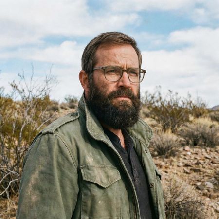
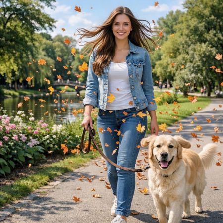
Golden Hour Stroll
Image EditingEdit instruction
“Add dynamic motion to this photo: make hair blow in the wind, add leaves flying, energetic and lively feel.”
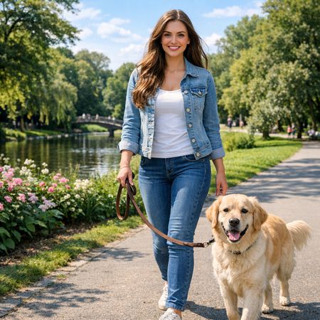
Grok Imagine Image
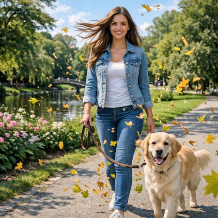
Grok Imagine Image Pro
67% wins
0% ties
33% wins
AI Judge Analysis
Grok Imagine Image
- + Expertly modifies the hair to flow outwards, creating a convincing sense of motion.
- + Higher density of flying leaves adds to the requested energetic and lively feel.
- + Preserves the original identity and details of the woman and dog almost perfectly.
- − The orange autumn leaves contrast slightly with the green summer trees in the background.
Grok Imagine Image Pro
- + Successfully adds motion to the hair and includes flying leaves throughout the scene.
- + Excellent preservation of the source image's lighting, background, and character details.
- + The yellow/green leaf colors blend more naturally with the existing foliage.
- − The hair blowing effect is slightly less dynamic than in the other model.
- − The dog's left ear is slightly distorted/warped compared to the original.
Verdict: Both models followed the instructions exceptionally well, preserving the source image while adding the requested motion. Grok Imagine (Model A) provides a more 'lively' feel with more dramatic hair movement and a higher volume of leaves, whereas Grok Imagine Pro (Model B) feels slightly more grounded and color-consistent with the environment, though it introduces a minor artifact on the dog's ear.
Vintage Cafe Logo
Text-to-Image“Vintage minimalist restaurant logo for "Caffè Florian", retro cloche dome with steam and "Est. 1720" banner, classic typography, warm brown and cream tones, subtle texture on light background, vector emblem style.”
Grok Imagine Image
Grok Imagine Image Pro
50% wins
0% ties
50% wins
AI Judge Analysis
Grok Imagine Image
- + Excellent typography with perfect character rendering and accent placement.
- + Sophisticated brown and cream color palette with beautiful shading.
- + Strong vector emblem composition with a professional, balanced layout.
- − Included the 'Est. 1720' text twice (header and footer).
- − The cloche has an odd cup handle and spoon growing out of the side.
Grok Imagine Image Pro
- + Clean, minimalist design that fits a circular badge style.
- + Accurately placed the 'Est. 1720' text on a banner element at the bottom.
- + Subtle paper texture more visible on the background.
- − The cloche is grey, which clashes with the requested 'warm brown' color scheme.
- − The typography is slightly irregular in spacing and font weight.
- − The steam looks like a single comma-shaped mark rather than elegant vapor.
Verdict: Grok Imagine Image wins due to its superior professional aesthetic and high-quality vector-style execution, despite including the date twice and some strange artifacts on the cloche. Grok Imagine Image Pro followed the banner placement more literally but failed to maintain the requested warm color palette for the central icon and produced less sophisticated typography.
Apollo 11: Journey to Tranquility
Text-to-Image“Create a clean, modern vector infographic poster about the Apollo 11 mission. NASA-inspired palette (navy, white, muted red, light gray). Flat-vector style, crisp lines, consistent iconography, subtle gradients only. Steps (stop at landing): 1. Launch (Saturn Vicon) 2. Earth Orbit (Earth + orbit ring icon) 3. Translunar (trajectory arc icon) 4. Lunar Orbit (Moon + orbit ring icon) 5. Descent (lunar module descending icon) 6. Landing (lunar module on the surface icon) Small supporting elements (minimal text): • Crew strip: three silhouette icons with only last names: Armstrong, Aldrin, Collins. • Landing site marker: Moon pin labeled "Tranquility" only. Layout constraints: generous margins, large readable labels, clean background with subtle stars. Vector-only, print-poster look, high resolution.”
Grok Imagine Image
Grok Imagine Image Pro
AI Judge Analysis
Grok Imagine Image
- + Follows the color palette closely with a strong navy background and nice use of muted red.
- + The flat-vector iconography is stylized and visually appealing for a poster.
- + Includes creative additional details like the crew strip and Tranquility Base map pin.
- − Contains several spelling errors in the labels (e.g., '3rajcoory', 'Transluiory', 'Moom').
- − The layout is somewhat cluttered and non-linear, making the chronological flow harder to follow.
Grok Imagine Image Pro
- + Excellent, clean layout with a clear vertical chronological flow.
- + Text rendering is highly accurate and readable for both main headers and supporting crew names.
- + Strict adherence to the requested icons for each of the six mission steps.
- − The color palette is a bit heavy on the light gray, making it feel slightly washed out compared to the 'NASA-inspired' request.
- − The trajectory arc for 'Translunar' is a bit small and understated compared to the other icons.
Verdict: Grok Imagine Image Pro (Model B) is the clear winner due to its superior layout, which perfectly conveys the timeline of the mission, and its significantly better text accuracy. While Grok Imagine Image (Model A) has a punchier color palette, the numerous spelling errors and disorganized layout make it less effective as an infographic.
Next steps
Explore each model
xAI's premium image generation model offering higher fidelity output and stronger performance on single-image editing benchmarks compared to the standard Grok Imagine model