

Reve AI's text-to-image generation model with strong aesthetic quality, accurate text rendering, and detailed instruction following capabilities
Settled by community votes across 8 shared challenges, with an AI judge weighing in on each.
Reve Image 1.0
20.0
arena score
#43 of 62 in Text-to-Image
Skill signature
· Text-to-Image
Wan 2.7
20.5
arena score
#39 of 62 in Text-to-Image
Vote tally
Where the votes landed
Reve Image 1.0
0%
win rate
Ties
0%
Wan 2.7
0%
win rate
Shared challenges
8
Challenge by challenge
The strongest take from each model on every shared challenge, with the AI judge's read.
Geometric Composition
Text-to-Image“A glass cube on a wooden table. Inside the cube is a small blue sphere. On top of the cube sits a red book. A green plant is behind the cube, partially visible through the glass. Soft window light from the left.”
Reve Image 1.0
Wan 2.7
AI Judge Analysis
Reve Image 1.0
- + Excellent adherence to lighting instructions with a clear shadow cast to the right
- + Clean aesthetic with minimalist composition
- + Spherical shape is perfectly rendered
- − The sphere appears to be floating mid-air, which may be physically unrealistic
- − The glass cube has some internal light blue coloring that acts more like liquid than a void
Wan 2.7
- + Highly realistic textures on the wooden table and the vintage red book
- + Complex and accurate reflections on the glass surfaces
- + The plant is clearly visible through the glass as requested
- − The red book is slightly too large for the cube's top surface
- − The blue sphere has a slightly textured/pitted surface rather than being a smooth sphere
Verdict: Reve Image 1.0 creates a cleaner, more stylized image with superior lighting and shadows, while Wan 2.7 excels in photo-realism and complex textures. Wan 2.7 is slightly better at the specific prompt requirement of showing the plant through the glass, whereas Reve Image 1.0 creates a more visually pleasing and artistically balanced scene.
Fantasy Warrior
Text-to-Image“Close portrait of a battle-worn paladin in ornate engraved plate armor, hair braided with small beads, faint scars and dirt on the skin, warm torchlight reflecting off metal, shallow depth of field, bokeh sparks, lifelike eyes, highly detailed texture on leather straps and cloth underlayer.”
Reve Image 1.0
Wan 2.7
AI Judge Analysis
Reve Image 1.0
- + Exquisite engraving detail on the plate armor
- + Atmospheric and warm lighting that realistically interacts with the metal surface
- + Accurate depiction of dirt on the skin
- − The facial features look very young and smooth, lacking a battle-worn look
- − The hair beads are clustered at the top in a somewhat messy fashion
Wan 2.7
- + Stronger adherence to the 'battle-worn' aesthetic with realistic scars and older facial features
- + Excellent execution of the braided hair with small beads
- + Great texture on leather straps and cloth underlayer
- − The engraving on the armor is slightly less intricate than in the other image
- − The bokeh sparks are more distinct but look a bit more artificial
Verdict: Wan 2.7 is the winner as it better captures the 'battle-worn' character requested in the prompt, featuring realistic scarring and an appropriately aged face. While Reve Image 1.0 has superior armor engraving, the character looks too youthful and the hair beads are less structured compared to the clear braids and beads in Wan 2.7.
Bald man challenge
Image EditingEdit instruction
“Give the person a full, thick head of natural hair with realistic texture, density, and a natural hairline. Preserve facial features and lighting.”
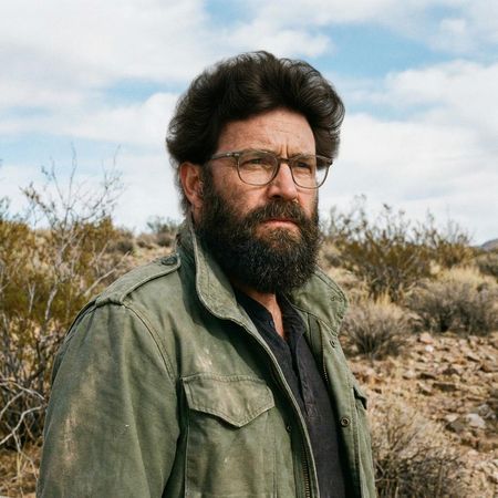
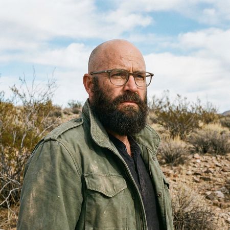
Reve Image 1.0
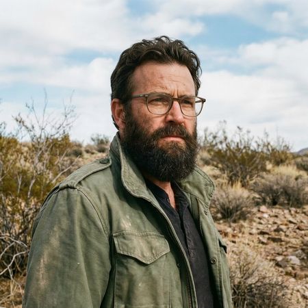
Wan 2.7
AI Judge Analysis
Reve Image 1.0
- + Successfully adds a full head of hair
- + Preserves facial features and clothing perfectly
- − Hair volume and shape look slightly unnatural or wig-like
- − Hairline appears a bit too high and rounded
Wan 2.7
- + Extremely realistic hair texture and style
- + Perfect integration with existing facial hair
- + Flawless preservation of the original image
Verdict: Both models performed excellently at preserving the source image while adding hair. However, Wan 2.7 produced a much more realistic and stylish result with better texture, whereas Reve Image 1.0 added hair that looks somewhat artificial and bloated.
Isometric Miniature Diorama Scenes
Text-to-Image“Create a clear, 45° top-down isometric miniature 3D cartoon scene of Japan's signature dish: sushi, with soft refined textures, realistic PBR materials, gentle lighting, on a small raised diorama base with minimal garnish and plate. Solid light blue background. At top-center: 'JAPAN' in large bold text, 'SUSHI' below it, small flag icon. Perfectly centered, ultra-clean, high-clarity, square format.”
Reve Image 1.0
Wan 2.7
AI Judge Analysis
Reve Image 1.0
- + Excellent adherence to the 'small diorama base' and 'minimal garnish' constraints.
- + Clean, stylized 3D cartoon aesthetic with soft lighting.
- + Perfect text layout and high-contrast typography.
- − The textures are a bit too simplified and plastic-like rather than 'realistic PBR'.
- − The rice lacks individual grain detail, appearing more like a solid block.
Wan 2.7
- + Outstanding PBR material quality with realistic rice grains and surface reflections.
- + Sophisticated modeling of the sushi varieties and chopsticks.
- + High professional polish on the text and graphics.
- − Included more elements (chopsticks, soy sauce, napkins) than the requested 'minimal garnish'.
- − The background isn't a solid light blue, it has a subtle gradient.
Verdict: Reve Image 1.0 followed the compositional instructions for a minimal diorama better, but Wan 2.7 significantly outperformed it in visual fidelity and material rendering. Wan 2.7's interpretation of 'realistic PBR textures' makes the food look much more appealing despite including a few extra props not explicitly asked for.
Over-the-top cartoon caricature
EditingEdit instruction
“Create a caricature of me and my job. Make it exaggerated and humorous, incorporating my profession as a tv show anchor and my love for dogs and hockey.”
Source
Reve Image 1.0
Wan 2.7
AI Judge Analysis
Reve Image 1.0
- + Excellent face preservation while translating the subject into a caricature style.
- + Clean, professional composition that clearly hits all three prompt requirements: TV anchor, dogs, and hockey.
- + Humorous details like the dog wearing a headset and tie add to the 'exaggerated' theme.
- − The transition from the microphone cord to the arm is a bit messy and illogical.
- − The hockey stick is positioned awkwardly, seemingly floating or stuck to the desk.
Wan 2.7
- + Successfully captures a more traditional comic-style caricature with high exaggeration.
- + Includes creative elements like the dog in a hockey helmet and a mini rink.
- + Maintains the selfie-style composition of the original source image.
- − The facial likeness is significantly changed compared to the source image.
- − Contains several text artifacts and misspellings like 'Rolee!'.
- − The composition feels very cluttered with several overlapping elements.
Verdict: Reve Image 1.0 is the superior choice because it maintains a clear likeness to the woman in the source image while perfectly balancing all the requested themes in a clean, professional-looking illustration. Wan 2.7 adopts a more exaggerated comic style, but the loss of likeness and the presence of nonsensical text 'Rolee!' make it less successful as a personalized caricature.
Studio Ghibli Anime Style
EditingEdit instruction
“Transform this photo into a Studio Ghibli–inspired illustration. Use soft pastel colors, hand-painted textures, gentle lighting, dreamy backgrounds, and a warm, nostalgic mood”
Source
Reve Image 1.0
Wan 2.7
AI Judge Analysis
Reve Image 1.0
- + Perfectly captures the Studio Ghibli character design style, including facial structures and expressions.
- + Excellent hand-painted background texture that matches the aesthetic of Ghibli films.
- + Preserves the composition and recognizable poses of the original meme flawlessly.
- − The main foreground character's face is quite blurry compared to the rest of the image.
Wan 2.7
- + Maintains high resolution and clarity throughout the image.
- + Applies a nice watercolor texture that meets the hand-painted requirement.
- + Preserves more of the facial resemblance to the real-life subjects in the source photo.
- − The faces look more like a general western sketch than actual Studio Ghibli character designs.
- − Fails to transform the background as convincingly into a dreamy Ghibli-style landscape as Model A.
Verdict: Reve Image 1.0 is the clear winner as it successfully transforms the style into authentic Studio Ghibli character art and background painting, whereas Wan 2.7 merely applies a watercolor filter over the existing faces. Reve Image 1.0 captures the specific artistic DNA of the request, perfectly hitting the 'nostalgic' and 'dreamy' mood of the prompt.
Golden Hour Stroll
Image EditingEdit instruction
“Add dynamic motion to this photo: make hair blow in the wind, add leaves flying, energetic and lively feel.”
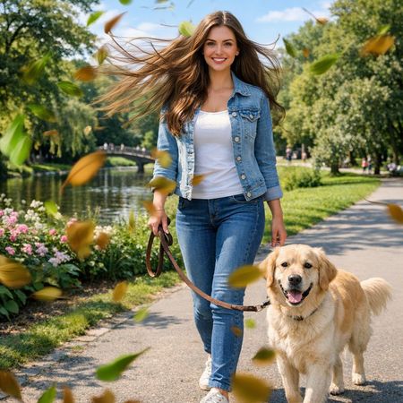
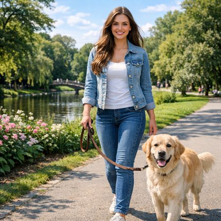
Reve Image 1.0
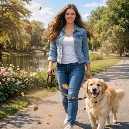
Wan 2.7
AI Judge Analysis
Reve Image 1.0
- + Strongly emphasizes the motion effect with many fluttering leaves
- + Creates a high-contrast, dramatic wind effect in the hair
- + Maintains excellent preservation of the subject's face and original clothing details
- − The leaf motion blur is a bit stylized and heavy-handed
- − Some hair strands look slightly jagged or digitally altered
Wan 2.7
- + Achieves a more naturalistic wind effect in the hair
- + Subtle and realistic placement of flying leaves
- + Perfectly preserves the source image context and lighting
- − The 'energetic and lively' feel is a bit muted compared to Model A
- − Fewer flying leaves than requested in the prompt
Verdict: Reve Image 1.0 does a better job of fulfilling the 'energetic and lively' part of the prompt by adding a significant amount of dynamic, blurred leaves and a more pronounced wind effect. Wan 2.7 is much more subtle and realistic, but it lacks the visual impact requested by the specific instruction for dynamic motion.
Apollo 11: Journey to Tranquility
Text-to-Image“Create a clean, modern vector infographic poster about the Apollo 11 mission. NASA-inspired palette (navy, white, muted red, light gray). Flat-vector style, crisp lines, consistent iconography, subtle gradients only. Steps (stop at landing): 1. Launch (Saturn Vicon) 2. Earth Orbit (Earth + orbit ring icon) 3. Translunar (trajectory arc icon) 4. Lunar Orbit (Moon + orbit ring icon) 5. Descent (lunar module descending icon) 6. Landing (lunar module on the surface icon) Small supporting elements (minimal text): • Crew strip: three silhouette icons with only last names: Armstrong, Aldrin, Collins. • Landing site marker: Moon pin labeled "Tranquility" only. Layout constraints: generous margins, large readable labels, clean background with subtle stars. Vector-only, print-poster look, high resolution.”
Reve Image 1.0
Wan 2.7
AI Judge Analysis
Reve Image 1.0
- + Clean vector aesthetic with crisp lines.
- + Accurate color palette according to instructions.
- + Good use of flat design for the planetary icons.
- − Poor typography with significant misspellings throughout the labels.
- − Incorrect iconography logic, such as representing 'Descent' with a moon and orbit ring.
Wan 2.7
- + Strong layout that follows a logical chronological flow from top to bottom.
- + Excellent text rendering for the main title and technical details.
- + Incorporates all requested steps accurately, including the trajectory arc and specific lunar module icons.
- − The 'Descent' icon is somewhat cluttered compared to the others.
- − Slight spelling error on 'Descript' and 'Tranquiliry'.
Verdict: Wan 2.7 is the clear winner for its superior layout and adherence to the complex sequence of the prompt. While Reve Image 1.0 captures the clean vector style well, its text is nonsensical and it fails to include several requested steps, whereas Wan 2.7 provides a complete, readable, and highly detailed infographic.
Next steps
Explore each model
Alibaba's Wan 2.7 image generation and editing model for text-to-image, reference-guided generation, and instruction-based image edits