

Reve AI's text-to-image generation model with strong aesthetic quality, accurate text rendering, and detailed instruction following capabilities
Settled by community votes across 8 shared challenges, with an AI judge weighing in on each.
Reve Image 1.0
20.1
arena score
#50 of 62 in Text-to-Image
Skill signature
· Text-to-Image
Wan 2.5 (Preview)
25.4
arena score
#11 of 62 in Text-to-Image
Vote tally
Where the votes landed
Reve Image 1.0
0.0%
win rate
Ties
0.0%
Wan 2.5 (Preview)
100.0%
win rate
0.0%
0.0% ties
100.0%
Shared challenges
8
Challenge by challenge
The strongest take from each model on every shared challenge, with the AI judge's read.
Geometric Composition
Text-to-Image“A glass cube on a wooden table. Inside the cube is a small blue sphere. On top of the cube sits a red book. A green plant is behind the cube, partially visible through the glass. Soft window light from the left.”
Reve Image 1.0
Wan 2.5 (Preview)
AI Judge Analysis
Reve Image 1.0
- + Excellent wood grain texture and light physics on the table surface.
- + Very clean glass rendering with believable reflections.
- + High visual quality with a modern aesthetic.
- − The plant is positioned to the side rather than behind the cube as requested.
- − The sphere appears to be floating mid-air inside the cube without a clear support.
Wan 2.5 (Preview)
- + Accurately places the plant behind the cube so it is visible through the glass.
- + Follows the spatial relationships of the prompt more closely.
- + Captures the 'soft window light' effect well with atmospheric dust particles.
- − The red book scale feels slightly off compared to the cube.
- − The sphere's reflection on the bottom surface of the glass is slightly misaligned with the object's base.
Verdict: Reve Image 1.0 produces a cleaner, more aesthetically polished image, but fails on the spatial requirement of placing the plant behind the cube. Wan 2.5 (Preview) correctly interprets the 'plant behind the cube' instruction and provides a more complex scene with better prompt adherence, despite slightly less refined glass physics.
Fantasy Warrior
Text-to-Image“Close portrait of a battle-worn paladin in ornate engraved plate armor, hair braided with small beads, faint scars and dirt on the skin, warm torchlight reflecting off metal, shallow depth of field, bokeh sparks, lifelike eyes, highly detailed texture on leather straps and cloth underlayer.”
Reve Image 1.0
Wan 2.5 (Preview)
AI Judge Analysis
Reve Image 1.0
- + Excellent detail on the engraved plate armor
- + Soft, cinematic lighting and color palette
- + Realistic skin texture and messy hair braids
- − The 'scars' look more like dirt or freckles than battle wounds
- − Lack of clear leather straps as requested in the prompt
Wan 2.5 (Preview)
- + Perfect adherence to all prompt details including leather straps and tattered cloth layers
- + Strong emotional expression and lifelike eyes
- + Crisp textures on the braids and metal engravings
- − The highlights on the beads look slightly artificial
- − Composition is very centered and standard
Verdict: While Reve Image 1.0 produces a beautiful cinematic image with impressive armor detail, Wan 2.5 (Preview) follows the prompt more accurately by including the requested leather straps and cloth underlayers. Wan 2.5 (Preview) also captures a more convincing 'battle-worn' look with its depiction of scars and intense expression.
Bald man challenge
Image EditingEdit instruction
“Give the person a full, thick head of natural hair with realistic texture, density, and a natural hairline. Preserve facial features and lighting.”
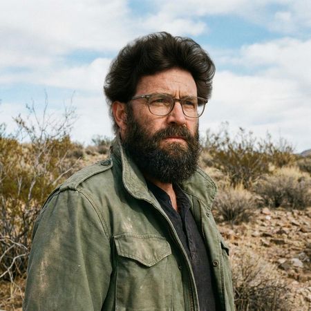
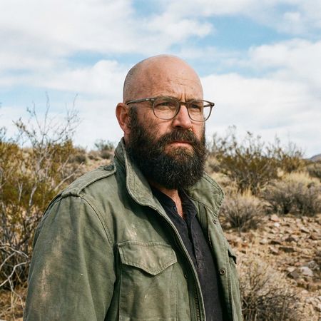
Reve Image 1.0
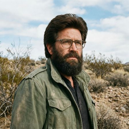
Wan 2.5 (Preview)
AI Judge Analysis
Reve Image 1.0
- + Excellent preservation of the original facial features and expression
- + Maintains original lighting and background perfectly
- + Follows the instruction to add a full head of hair
- − The hair texture looks slightly more like a rug or synthetic material than natural human hair
- − The hairline integration on the forehead is a bit harsh
Wan 2.5 (Preview)
- + Provides a more realistic, wavy hair texture that blends naturally with the sideburns
- + Better integration of the hairline with the forehead skin
- + Higher hair density that feels grounded in real-world physics
- − Slightly alters the eyebrows compared to the source image
- − The hair volume is very high, bordering on a 'toupee' look despite the realistic texture
Verdict: Both models do an excellent job of preserving the source image while adding the requested hair. Reve Image 1.0 is superior at keeping the face exactly as it was, whereas Wan 2.5 (Preview) provides a significantly more realistic and natural-looking hair texture that blends seamlessly into the existing beard and sideburns.
Isometric Miniature Diorama Scenes
Text-to-Image“Create a clear, 45° top-down isometric miniature 3D cartoon scene of Japan's signature dish: sushi, with soft refined textures, realistic PBR materials, gentle lighting, on a small raised diorama base with minimal garnish and plate. Solid light blue background. At top-center: 'JAPAN' in large bold text, 'SUSHI' below it, small flag icon. Perfectly centered, ultra-clean, high-clarity, square format.”
Reve Image 1.0
Wan 2.5 (Preview)
AI Judge Analysis
Reve Image 1.0
- + Excellent adherence to the square isometric diorama base prompt.
- + Clean, playful 3D cartoon style with soft lighting.
- + Accurately rendered text and flag placement.
- − Textures are a bit too simplified and dough-like, lacking the PBR material feel.
- − The green sushi topping is ambiguous and less appealing.
Wan 2.5 (Preview)
- + Superior PBR material rendering with realistic subsurface scattering on the fish.
- + High clarity and sophisticated lighting effects.
- + Professional typography and layout composition.
- − Failed to provide the 'raised diorama base', opting for a simple circular stand.
- − Perspective is more eye-level than the requested 45° top-down isometric view.
Verdict: Reve Image 1.0 followed the structural instructions more closely, accurately depicting the 45-degree isometric perspective and the square diorama base. However, Wan 2.5 (Preview) produced a significantly higher quality image in terms of materials, lighting, and realistic food textures, making it the more visually striking interpretation despite the perspective shift.
Over-the-top cartoon caricature
EditingEdit instruction
“Create a caricature of me and my job. Make it exaggerated and humorous, incorporating my profession as a tv show anchor and my love for dogs and hockey.”
Source
Reve Image 1.0
Wan 2.5 (Preview)
AI Judge Analysis
Reve Image 1.0
- + Excellent preservation of the subject's facial features while applying a caricature style
- + Highly creative integration of themes, including the dog wearing a headset and tie
- + Good balance of professional 'News' graphics and hockey elements
- − The hand holding the microphone is poorly rendered with too many fingers
- − The hockey stick is positioned awkwardly, seemingly floating in front of the desk
Wan 2.5 (Preview)
- + Successfully captures the requested 'caricature' style with exaggerated facial expressions
- + Incorporate all elements including hockey on the screen and multiple dogs
- + Preserves the original denim outfit from the source image
- − The facial likeness to the original subject is significantly weaker than Model A
- − The composition feels more like a generic clip-art illustration than a personalized caricature
- − The microphone is floating in front of her hand rather than being held correctly
Verdict: Reve Image 1.0 is the clear winner because it manages to maintain a recognizable likeness of the woman while successfully stylizing her into a caricature. It also shows superior creativity by making the dog part of the news team, whereas Wan 2.5 (Preview) produces a more generic cartoon that loses the subject's distinct facial identity.
Studio Ghibli Anime Style
EditingEdit instruction
“Transform this photo into a Studio Ghibli–inspired illustration. Use soft pastel colors, hand-painted textures, gentle lighting, dreamy backgrounds, and a warm, nostalgic mood”
Source
Reve Image 1.0
Wan 2.5 (Preview)
0% wins
0% ties
100% wins
AI Judge Analysis
Reve Image 1.0
- + Excellent adherence to the Studio Ghibli art style, especially the facial features and line work.
- + Strong hand-painted texture feel that matches the requested vibe.
- + Maintains the composition and the specific expressions of the famous meme perfectly.
- − The out-of-focus foreground character is a bit blurry compared to the rest of the image.
- − Background details are slightly simplified.
Wan 2.5 (Preview)
- + High visual clarity and clean rendering throughout the image.
- + Successfully incorporates dreamy elements like floating leaves and sparkles.
- + Excellent preservation of the original image's clothing patterns and colors.
- − The art style leans more towards modern generic anime than specifically 'Studio Ghibli'.
- − The man's expression is more concerned/confused than the original's 'distracted' look.
Verdict: Reve Image 1.0 is the clear winner as it perfectly captures the iconic Studio Ghibli aesthetic, from the specific eye shapes to the painterly background textures. While Wan 2.5 (Preview) produces a high-quality illustration, it feels like a modern digital anime style rather than the hand-drawn, nostalgic Ghibli look requested.
Golden Hour Stroll
Image EditingEdit instruction
“Add dynamic motion to this photo: make hair blow in the wind, add leaves flying, energetic and lively feel.”
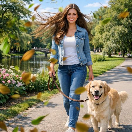
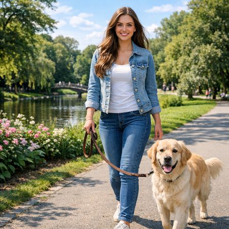
Reve Image 1.0
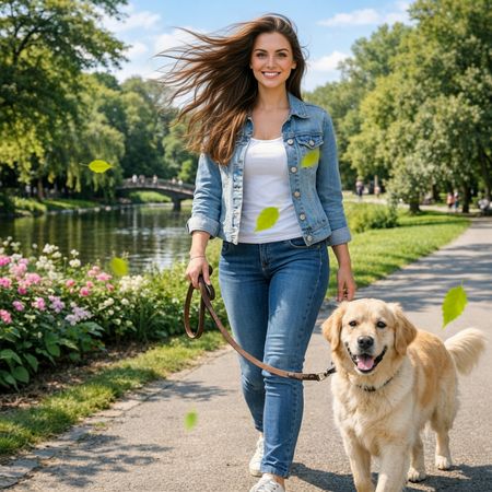
Wan 2.5 (Preview)
AI Judge Analysis
Reve Image 1.0
- + Excellent execution of blowing hair with realistic volume and movement.
- + High density of flying leaves creates a strong sense of wind.
- + Strong motion blur on the leaves adds to the energetic feel.
- − The leaf colors are a bit brownish/autumnal which slightly shifts the summer lighting of the source image.
- − Some leaves are quite large and may feel slightly cluttered.
Wan 2.5 (Preview)
- + Subtle and realistic blowing hair effect.
- + Successfully preserved the original color palette and lighting better than the competitor.
- + Leaves are more spaced out, allowing the subject to remain clear.
- − The 'flying leaves' appear very static and look more like stickers than moving objects.
- − Lacks the 'energetic and lively' dynamic motion requested compared to the alternative.
Verdict: Reve Image 1.0 is the clear winner as it fully embraced the 'dynamic motion' request by adding motion blur to the leaves and giving the hair significant flow. Wan 2.5 (Preview) was too conservative, resulting in leaves that look like they are floating static in mid-air rather than being blown by wind.
Apollo 11: Journey to Tranquility
Text-to-Image“Create a clean, modern vector infographic poster about the Apollo 11 mission. NASA-inspired palette (navy, white, muted red, light gray). Flat-vector style, crisp lines, consistent iconography, subtle gradients only. Steps (stop at landing): 1. Launch (Saturn Vicon) 2. Earth Orbit (Earth + orbit ring icon) 3. Translunar (trajectory arc icon) 4. Lunar Orbit (Moon + orbit ring icon) 5. Descent (lunar module descending icon) 6. Landing (lunar module on the surface icon) Small supporting elements (minimal text): • Crew strip: three silhouette icons with only last names: Armstrong, Aldrin, Collins. • Landing site marker: Moon pin labeled "Tranquility" only. Layout constraints: generous margins, large readable labels, clean background with subtle stars. Vector-only, print-poster look, high resolution.”
Reve Image 1.0
Wan 2.5 (Preview)
AI Judge Analysis
Reve Image 1.0
- + Successfully captures the requested flat-vector iconography style.
- + Clean layout with a consistent grid and color palette.
- + Adheres and numbers the specific sequence of events from the prompt.
- − Significant spelling errors in prominent text like 'Lunnr', 'Dessent', and 'Anmlot'.
- − Iconography is very generic and lacks specific NASA-inspired detail.
- − The Saturn V icon is represented as a generic rocket shape.
Wan 2.5 (Preview)
- + Excellent text rendering with near-perfect spelling for key labels.
- + Highly detailed and accurate vector illustrations of the Saturn V and Lunar Module.
- + Effective use of the requested NASA color palette and space-themed background.
- − The 'Descent' and 'Landing' steps are clustered together rather than shown as distinct iconographic steps.
- − The trajectory lines for 'Translunar' are a bit cluttered and overlap the Earth and Moon.
- − Small human avatars in the bottom left are stylized inconsistently compared to the vehicles.
Verdict: Wan 2.5 (Preview) produced a superior infographic with accurate, recognizable illustrations of NASA hardware and highly legible, correctly spelled text. While Reve Image 1.0 followed the ordered list structure more rigidly, its pervasive spelling errors and overly simplistic icon style make it less effective as a professional-looking poster.
Next steps
Explore each model
Alibaba's text-to-image and image-to-image generation model from the Wan AI suite, offering high-quality visual generation capabilities