
Black Forest Labs' compact, open-source image generation model with sub-second inference, optimized for production and near real-time applications with multi-reference support
Settled by community votes across 19 shared challenges, with an AI judge weighing in on each.
FLUX.2 [klein] 4B
22.3
arena score
#32 of 62 in Text-to-Image
Skill signature
· Text-to-Image
FLUX.2 [pro]
26.3
arena score
#8 of 62 in Text-to-Image
Vote tally
Where the votes landed
FLUX.2 [klein] 4B
0%
win rate
Ties
0%
FLUX.2 [pro]
0%
win rate
Shared challenges
19
Challenge by challenge
The strongest take from each model on every shared challenge, with the AI judge's read.
Geometric Composition
Text-to-Image“A glass cube on a wooden table. Inside the cube is a small blue sphere. On top of the cube sits a red book. A green plant is behind the cube, partially visible through the glass. Soft window light from the left.”
FLUX.2 [klein] 4B
FLUX.2 [pro]
AI Judge Analysis
FLUX.2 [klein] 4B
- + Excellent photographic texture on the book cover and sphere
- + Strong adherence to the window lighting instruction with realistic shadows
- + Great sense of depth and focus
- − The glass cube has some slight perspective distortion on the vertical edges
- − The plant in the background is quite blurry, making the 'visible through glass' effect less distinct
FLUX.2 [pro]
- + Very clean and precise geometric rendering of the glass cube
- + Subtle and realistic text details on the spine of the red book
- + Clearer visibility of the plant through the glass
- − The sphere texture is a bit matte and lacks the depth seen in the other image
- − The composition feels slightly more digital and less like a raw photograph
Verdict: Both models followed the prompt perfectly, including the specific spatial relationships between objects. FLUX.2 [klein] 4B produced a more tactile, organic photograph with superior lighting, while FLUX.2 [pro] excelled in the technical rendering of the glass cube's geometry and text details on the book.
Man and Car in California
EditingEdit instruction
“Make a photo of the man driving the car down the California coastline”
Source
FLUX.2 [klein] 4B
FLUX.2 [pro]
AI Judge Analysis
FLUX.2 [klein] 4B
- + Excellent preservation of the car's geometry and details.
- + Captures the man's likeness and clothing (plaid coat) very accurately.
- + Highly realistic motion blur on the road and wheels.
- − The man appears slightly small in the seat compared to the car's scale.
- − The background lighting is a bit hazy.
FLUX.2 [pro]
- + Excellent integration of the man's facial expression and hair from the source image.
- + Strong composition with a vibrant, clear coastline background.
- + Strong source preservation of the white Rolls Royce.
- − The man's arm and shoulder structure looks a bit awkward against the door.
- − The perspective of the rear wheel seems slightly off compared to the original.
Verdict: Both models performed exceptionally well, successfully merging the two source images into a new environment. FLUX.2 [klein] 4B is slightly better at preserving the specific clothing texture (the plaid coat) and realistic motion, while FLUX.2 [pro] captured a more joyful expression and a clearer California background. FLUX.2 [klein] 4B is the winner for slightly better scale and lighting consistency between the subject and the vehicle.
Candid Street Photography
Text-to-Image“A candid street photo of an elderly Japanese man repairing a red bicycle in light rain, reflections on wet pavement, shallow depth of field, 50mm lens, natural skin texture, imperfect framing, motion blur from passing cars, cinematic but realistic, no stylization.”
FLUX.2 [klein] 4B
FLUX.2 [pro]
AI Judge Analysis
FLUX.2 [klein] 4B
- + Excellent depiction of rain droplets and pavement textures.
- + High level of detail in the subject's face and clothing.
- + Effective use of the 'red bicycle' as a focal point.
- − The placement of the man in the middle of a busy road feels unrealistic and dangerous.
- − Significant anatomical and mechanical errors in the bicycle structure, especially the frame/seat area.
- − Failed to incorporate motion blur from passing cars.
FLUX.2 [pro]
- + Much more realistic composition with the man safely on a sidewalk/curb.
- + Captures the requested motion blur from passing cars very well.
- + Includes subtle 50mm lens characteristics like vignetting and localized circular ripples in water.
- − Image lacks the sharpness and fine facial details of the other model.
- − The bicycle's rear structure and chain alignment are still somewhat abstract.
- − The light rain is less visible than in the competing image.
Verdict: FLUX.2 [pro] wins because it better understands the context of a 'candid street photo,' placing the subject on a sidewalk rather than in the center of active traffic like FLUX.2 [klein] 4B. Additionally, FLUX.2 [pro] followed more of the technical prompt instructions, specifically the motion blur and the imperfect framing, resulting in a more cinematic and believable scene.
Fantasy Warrior
Text-to-Image“Close portrait of a battle-worn paladin in ornate engraved plate armor, hair braided with small beads, faint scars and dirt on the skin, warm torchlight reflecting off metal, shallow depth of field, bokeh sparks, lifelike eyes, highly detailed texture on leather straps and cloth underlayer.”
FLUX.2 [klein] 4B
FLUX.2 [pro]
AI Judge Analysis
FLUX.2 [klein] 4B
- + Excellent symmetrical engraving on the breastplate
- + Clean and realistic skin texture
- + Strong adherence to the braided hair with beads request
- − Lighting feels a bit flat compared to the warmth requested
- − The character looks more like a modern actor in a costume than a battle-worn warrior
FLUX.2 [pro]
- + Superb cinematic lighting with strong golden torchlight reflections
- + Very high-quality texture on the leather straps and burlap hood
- + More convincing battle-worn aesthetic with deeper scars and dirt
- − The sparks have a slight motion blur that feels a bit streaky
- − Hair texture is slightly chaotic and less distinct than Model A
Verdict: Both models followed the prompt exceptionally well, but FLUX.2 [pro] captures the atmosphere of the 'warm torchlight' and 'battle-worn' description more effectively through superior lighting and texture depth. FLUX.2 [klein] 4B produces a very clean, high-fidelity portrait, but it feels slightly more staged and less immersive than the gritty realism in FLUX.2 [pro].
Modern Clean Menu
Text-to-Image“Modern minimalist restaurant menu design, white background with colorful food photos in grid, sections for appetizers/pizza/mains, bold sans-serif fonts, vibrant accents, clean professional layout for casual dining.”
FLUX.2 [klein] 4B
FLUX.2 [pro]
AI Judge Analysis
FLUX.2 [klein] 4B
- + Features a high density of vibrant color food photographs.
- + Implements a sophisticated and modern typography style with clean sans-serif fonts.
- + Uses a diverse range of gourmet food imagery that feels professional.
- − The text is almost entirely gibberish and includes several typos in headers (e.g., 'MDANS').
- − The layout is slightly cluttered with overlapping images and poorly aligned text columns.
FLUX.2 [pro]
- + Exhibits superior text legibility and significantly better spelling accuracy.
- + Follows the requested grid layout and section headers more logically for a functional menu.
- + Includes clear pricing and item descriptions that enhance the 'casual dining' feel requested.
- − The placeholder text for pizza and mains is repetitive and logically inconsistent (e.g., Garlic Bread in 'Mins').
- − The background imagery of a grey concrete floor adds unnecessary visual noise compared to a clean digital export look.
Verdict: FLUX.2 [pro] is the preferred choice because it successfully creates a functional, legible menu format with clear sections and logical pricing, whereas FLUX.2 [klein] 4B suffers from severe spelling errors and a disorganized layout. FLUX.2 [pro] also managed the prompt requirements for specific sections (Appetizers, Pizza, Mains) much more effectively.
Magic Burger Explosion: Fiery Photorealism Challenge
Text-to-Image“Ad for 'Magic Burger'. Dynamic, exploded burger with all components (bun, patty, cheese, lettuce, tomato, sauce) suspended in mid-air. Emphasize photorealistic detail and a sense of motion. Dark, fiery background with glowing embers. Integrate text: 'MAGIC BURGER' as a prominent title, 'LIMITED TIME ONLY' as a secondary message, and '€6.99' in a starburst, all rendered with a fiery, glowing effect.”
FLUX.2 [klein] 4B
FLUX.2 [pro]
AI Judge Analysis
FLUX.2 [klein] 4B
- + Excellent photorealistic texture on the meat and bun
- + Clean rendering of the secondary text and price starburst
- + Engaging, high-contrast dynamic background
- − Severe spelling errors and overlapping in the main title
- − Fails to follow the 'exploded' instruction, showing an almost fully assembled burger
FLUX.2 [pro]
- + Perfectly adheres to the 'exploded' layout with suspended components
- + Text is accurately spelled and features the requested fiery/glowing effect
- + Composition creates a better sense of motion with sauce droplets and swirling embers
- − The '€6.99' text is slightly less crisp than the other text elements
- − The top bun looks a bit matte compared to the highly detailed bottom bun
Verdict: FLUX.2 [pro] is the clear winner as it successfully follows the 'exploded burger' requirement and flawlessly renders all requested text. While FLUX.2 [klein] 4B has impressive surface textures, it fails the layout instruction and has unusable, garbled text for the main title.
Chalkboard Menu
Text-to-Image“Handwritten-style chalkboard menu in a cozy café, all text rendered in the exact same realistic chalk handwriting style with natural variations in letter size, slight slant, and chalk texture — no printed or digital fonts anywhere on the board. Title at the top in elegant cursive chalk handwriting: ‘TODAY’S SPECIALS – APRIL 30, 2026’. Below it, three menu items also in the same handwritten chalk style: ‘Truffle Mushroom Risotto – $24’, ‘Grilled Octopus with Lemon & Herbs – $28’, ‘Brown Butter Chocolate Chip Cookies – $9’. At the very bottom, smaller text in the identical handwritten chalk style (slightly smaller but still clearly legible with the same handwriting characteristics): ‘All items made fresh daily • Ask about our gluten-free options’. Warm ambient café lighting, visible chalk dust and smudges, realistic handwriting imperfections, no clean printed text anywhere.”
FLUX.2 [klein] 4B
FLUX.2 [pro]
AI Judge Analysis
FLUX.2 [klein] 4B
- + Excellent chalk texture and realistic smudge marks across the board.
- + Consistently elegant handwriting style that looks authentically hand-lettered.
- + Correctly interpreted the incomplete 'Brown But...' prompt to conclude with 'Cookies'.
- − Multiple spelling errors including 'Truffel', 'Musheram', 'Ootrpous', and 'Brawn'.
- − Poor letter spacing in the word 'SPECIALS' with a strange gap.
FLUX.2 [pro]
- + Perfect spelling across all menu items and descriptions.
- + Better composition showing the café context with a shallow depth-of-field background.
- + Highly legible handwriting while maintaining the requested cursive chalk style.
- − The chalk texture on the letters is slightly less varied and feels a bit cleaner than real chalk.
- − The date line is less 'elegant cursive' than the main title line.
Verdict: FLUX.2 [pro] is the clear winner because it maintains perfect spelling and professional presentation whereas FLUX.2 [klein] 4B suffers from numerous distracting typos like 'Musheram' and 'Ootrpous'. While both models captured the 'cozy café' atmosphere and chalk aesthetic well, FLUX.2 [pro] provided a much more usable and coherent image.
Pose & Character Mashup
EditingEdit instruction
“Use Image 1 as the exact pose reference and Image 2 as the character reference. Recreate the person/character from Image 2 in the exact dynamic pose and body position from Image 1. Keep the exact face, hair, clothing style/details, and expression from Image 2. Match the lighting and environment of Image 1. The final image must show the character from Image 2 performing the precise action/pose from Image 1 with perfect anatomy and natural integration.”
Source
FLUX.2 [klein] 4B
FLUX.2 [pro]
AI Judge Analysis
FLUX.2 [klein] 4B
- + Successfully replicates the exact complex leg-cross pose from Image 1.
- + Retains the flowing long hair aesthetic from the original pose image while blending the character's facial features.
- + Accurately recreates the red stool and yellow background environment.
- − The hair is a mix of the two source images, losing the short hair character reference from Image 2.
- − Face is slightly distorted and does not match the character reference precisely.
FLUX.2 [pro]
- + Perfectly captures the character's face, hair, and clothing details from Image 2.
- + Very high visual quality with realistic skin textures and lighting.
- + Naturally integrates the character's existing outfit into the scene.
- − Fails to follow the pose instruction, opting for a standard crouch instead of the specific cross-legged pose in Image 1.
- − The right leg is anatomically confusing where it meets the stool.
Verdict: FLUX.2 [klein] 4B followed the structural instructions much better by precisely replicating the difficult dynamic pose from Image 1, though it struggled with character consistency. FLUX.2 [pro] produced a much higher quality character representation that look exactly like Image 2, but it almost entirely ignored the core 'exact pose' instruction, providing a simple crouch instead. FLUX.2 [klein] 4B is the winner for better adhering to the complex requirements of the edit prompt.
The Reversed Rodeo
Text-to-Image“Horse riding astronaut in space — horse on top, not vice versa. Surreal, highly detailed, cinematic.”
FLUX.2 [klein] 4B
FLUX.2 [pro]
AI Judge Analysis
FLUX.2 [klein] 4B
- + High level of detail in the space suit and horse leather gear.
- + Excellent cinematic lighting and background composition.
- + Clear, sharp rendering of textures and anatomy.
- − Prompt adherence failure: The astronaut is riding the horse, disregarding the 'horse on top' instruction.
FLUX.2 [pro]
- + Followed the specific instruction for the horse to be on top.
- + Creative and surreal interpretation of the prompt.
- + Atmospheric lighting with beautiful galaxy backgrounds.
- − Anatomical issues with the horse's legs appearing to merge or disappear into the astronaut.
- − The lower half of the composition is somewhat cluttered and confusing.
Verdict: FLUX.2 [klein] 4B ignored the negative constraint/positional instruction, providing a standard 'astronaut on horse' image that, while beautiful, fails the prompt. FLUX.2 [pro] successfully followed the difficult instruction of placing the horse on top of the astronaut, making it the winner for adherence despite some anatomical clipping.
The Capybara Taxi Driver
Text-to-Image“Photorealistic scene inside a yellow New York taxi at night. A capybara is driving, wearing a yellow taxi driver cap and a dark jacket. It has a calm, professional expression and both front paws on the steering wheel. In the back seat sits a human businesswoman in a coat, looking at her phone with a completely normal, bored expression (as if this is just another normal ride). Through the windows you can see the streets of Manhattan at night with blurred lights. Realistic taxi interior, photorealistic, detailed fur and fabric, 35mm lens, night lighting with reflections, shallow depth of field.”
FLUX.2 [klein] 4B
FLUX.2 [pro]
AI Judge Analysis
FLUX.2 [klein] 4B
- + Excellent character framing with both subjects clearly visible
- + Detailed fur texture on the capybara
- + Accurately captures the bored expression of the businesswoman
- − The vehicle interior looks more like a small vintage car than a standard NYC taxi
- − The steering wheel and dashboard are simplified and lack realistic textures
FLUX.2 [pro]
- + Highly realistic and detailed modern car interior and dashboard
- + Cinematic lighting with realistic rain/bokeh on the glass
- + Capybara is wearing a more traditional taxi driver cap
- − The businesswoman in the back is quite small and out of focus compared to the prompt's emphasis
- − The capybara's hands/paws look slightly like human hands in gloves rather than paws
Verdict: FLUX.2 [pro] wins on technical execution and interior realism, creating a convincing cinematic atmosphere with a highly detailed dashboard and lighting. However, FLUX.2 [klein] 4B followed the compositional cues better by making the passenger a more prominent part of the scene, even if the car interior feels a bit more like a toy.
The Halloween Invitation
Text-to-Image“Vintage gothic Halloween party invitation. Dark parchment poster, spooky border with webs and thorns, central glowing jack-o-lantern, bats, twisted trees, moody night sky. Add elegant gothic title text saying "Halloween Party Invitation", a small scroll banner saying "You are invited to a night of frights", and event details at the bottom: Date: 30.10.2026 Time: 7pm Location: The Arches, NYC Spooky but polished, cinematic lighting, square format.”
FLUX.2 [klein] 4B
FLUX.2 [pro]
AI Judge Analysis
FLUX.2 [klein] 4B
- + Strong composition with a cohesive border of thorns and webs.
- + Effective cinematic lighting on the central jack-o-lantern.
- − Several severe spelling errors in the main title and event details.
- − Large chunks of the required text were misrendered or omitted.
FLUX.2 [pro]
- + Perfect text rendering for all requested fields including date and location.
- + High-quality visual elements with a well-defined parchment texture and scroll banner.
- + Includes all requested elements like trees, bats, and the full moon.
- − The thorns in the border are a bit thin compared to the thicker webs.
Verdict: FLUX.2 [pro] followed the prompt perfectly, rendering all the specific text strings without error, whereas FLUX.2 [klein] 4B struggled significantly with typography, producing illegible words. FLUX.2 [pro] also managed the layout better, creating a professional-looking invitation that meets every requirement of the prompt.
Bald man challenge
Image EditingEdit instruction
“Give the person a full, thick head of natural hair with realistic texture, density, and a natural hairline. Preserve facial features and lighting.”

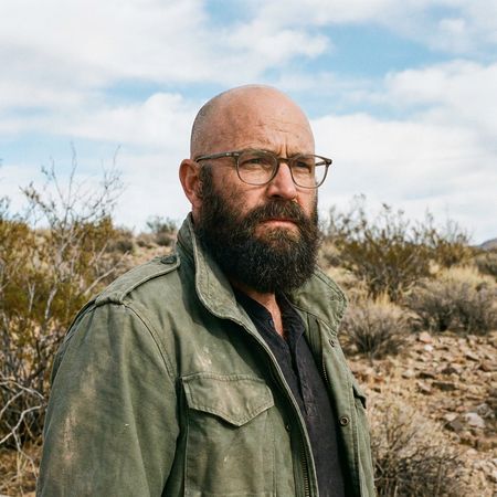
FLUX.2 [klein] 4B

FLUX.2 [pro]
AI Judge Analysis
FLUX.2 [klein] 4B
- + Excellent preservation of the original face, beard, and lighting
- + Realistic hair texture and natural integration with the sideburns
- + Seamless hairline that matches the forehead skin tone
- − Minimal stray hairs against the background are slightly softer than the source image sharpness
FLUX.2 [pro]
- + Successfully adds a thick head of hair while keeping the background intact
- − Significantly alters the person's facial features around the eyes and brow
- − The hair and beard color shifted to a lighter brown, losing the dark salt-and-pepper look of the original
- − Hairline and forehead skin texture appear slightly artificial
Verdict: FLUX.2 [klein] 4B is the clear winner as it followed the instruction to preserve facial features perfectly while adding a realistic, well-blended head of hair. FLUX.2 [pro] failed the preservation aspect of the task, noticeably changing the subject's face and beard color, making him look like a different person.
Isometric Miniature Diorama Scenes
Text-to-Image“Create a clear, 45° top-down isometric miniature 3D cartoon scene of Japan's signature dish: sushi, with soft refined textures, realistic PBR materials, gentle lighting, on a small raised diorama base with minimal garnish and plate. Solid light blue background. At top-center: 'JAPAN' in large bold text, 'SUSHI' below it, small flag icon. Perfectly centered, ultra-clean, high-clarity, square format.”
FLUX.2 [klein] 4B
FLUX.2 [pro]
AI Judge Analysis
FLUX.2 [klein] 4B
- + Excellent realistic textures on the salmon and rice
- + Accurate 45-degree isometric camera angle
- + Clean high-clarity rendering of the plate
- − Failed to render the Japanese flag correctly, showing a red/white striped icon instead
- − Missed the 'diorama base' requirement, placing the plate directly in the void
- − The text alignment and shadow are a bit disconnected from the scene
FLUX.2 [pro]
- + Perfectly followed all prompt instructions including the diorama base and Japanese flag
- + Clean, stylized 3D cartoon aesthetic with bold, centered text
- + Effective use of PBR-style lighting and shadows that ground the object
- − The textures are more 'clay-like' than 'refined realistic'
- − The rice texture is represented by large uniform bumps rather than realistic grains
Verdict: FLUX.2 [pro] is the clear winner as it followed every detail of the prompt, specifically the inclusion of a diorama base and a correct Japanese flag, which FLUX.2 [klein] 4B missed. While FLUX.2 [klein] 4B had more realistic food textures, it failed on the composition and symbolic accuracy required for the scene.
Over-the-top cartoon caricature
EditingEdit instruction
“Create a caricature of me and my job. Make it exaggerated and humorous, incorporating my profession as a tv show anchor and my love for dogs and hockey.”
Source
FLUX.2 [klein] 4B
FLUX.2 [pro]
AI Judge Analysis
FLUX.2 [klein] 4B
- + Captures the user's facial features and hair color accurately in a caricature style
- + Strongly represents the 'TV show anchor' aspect with a professional studio background and news desk
- + Includes dogs as requested
- − Completely misses the hockey requirement
- − The hands and fingers are poorly rendered and distorted
FLUX.2 [pro]
- + Successfully incorporates all three elements: TV anchor, dogs, and hockey (sticks, pucks, ice rink screen)
- + High visual quality with clean lines and consistent cartoon shading
- + Effectively captures the 'humorous and exaggerated' tone requested
- − The facial likeness to the source image is slightly more generic than model a
- − Hand anatomy is slightly stylized but a bit awkward
Verdict: While FLUX.2 [klein] 4B followed the professional anchor setting well, it failed to include any hockey elements. FLUX.2 [pro] is the clear winner as it creatively blended all prompt requirements, placing the dogs in hockey gear and adding hockey-themed details to the news desk.
Adorable Baby Animals in Sunny Meadow
Text-to-Image“Hyper-photorealistic scene of fluffy baby animals—a golden retriever puppy, tabby kitten, baby bunny, and red fox kit—with big expressive eyes and ultra-detailed soft fur, playfully chasing butterflies and tumbling together in a lush wildflower meadow, warm golden sunrise light with god rays and dew sparkles, joyful wholesome vibe, 8K masterpiece.”
FLUX.2 [klein] 4B
FLUX.2 [pro]
AI Judge Analysis
FLUX.2 [klein] 4B
- + Features vibrant, dynamic lighting with clearly defined god rays.
- + Includes all four specified animal types: retriever, two kittens/cats, and a fox.
- − Completely failed to include the requested baby bunny.
- − The anatomy of the standing kitten is slightly awkward with a trailing fifth limb or tail merging poorly.
FLUX.2 [pro]
- + Successfully included all four specific animals: puppy, kitten, bunny, and fox.
- + Higher level of realism in fur texture and lighting integration.
- + Better composition where animals are more convincingly interacting with each other.
- − The god rays are much more subtle and less defined than in Model A.
- − One butterfly is strangely positioned directly on the fox's nose in a way that looks slightly flat.
Verdict: FLUX.2 [pro] is the superior model as it successfully followed the complex prompt by including all four distinct animals, whereas FLUX.2 [klein] 4B missed the baby bunny entirely. Additionally, FLUX.2 [pro] exhibited more natural textures and a cohesive interaction between the subjects, making it a better fit for the 'hyper-photorealistic' requirement.
Studio Ghibli Anime Style
EditingEdit instruction
“Transform this photo into a Studio Ghibli–inspired illustration. Use soft pastel colors, hand-painted textures, gentle lighting, dreamy backgrounds, and a warm, nostalgic mood”
Source
FLUX.2 [klein] 4B
FLUX.2 [pro]
AI Judge Analysis
FLUX.2 [klein] 4B
- + Excellent application of soft pastel colors and dreamy, high-key lighting.
- + Beautiful watercolor-style textures that match the requested hand-painted feel.
- + Great preservation of the specific body language from the original meme.
- − The characters' expressions are a bit too generic and cheerful, losing the 'shocked/angry' dynamic shown in the original source.
FLUX.2 [pro]
- + Perfect captures the Ghibli anime aesthetic in terms of line art and character design.
- + Maintains the specific facial emotions of the source image much better than Model A.
- + Preserves background elements like the red bus from the source while stylizing them.
- − The colors are slightly more muted or 'vintage' paper-style rather than the vibrant soft pastels requested.
Verdict: Both models successfully transformed the meme into a Ghibli-inspired world. FLUX.2 [klein] 4B excels at the painterly watercolor aesthetic and the soft pastel lighting requested. However, FLUX.2 [pro] is the winner for its superior ability to translate the emotional narrative and specific character expressions of the original photo into the anime style while still capturing the hand-painted texture.
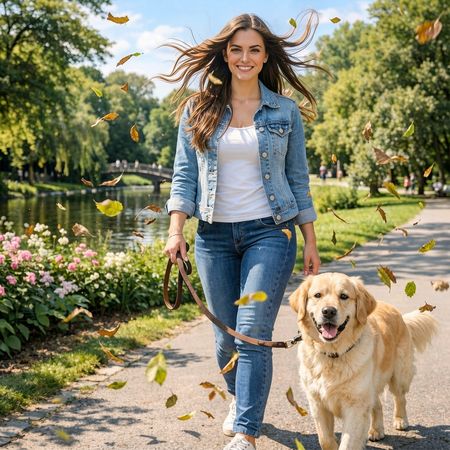
Golden Hour Stroll
Image EditingEdit instruction
“Add dynamic motion to this photo: make hair blow in the wind, add leaves flying, energetic and lively feel.”
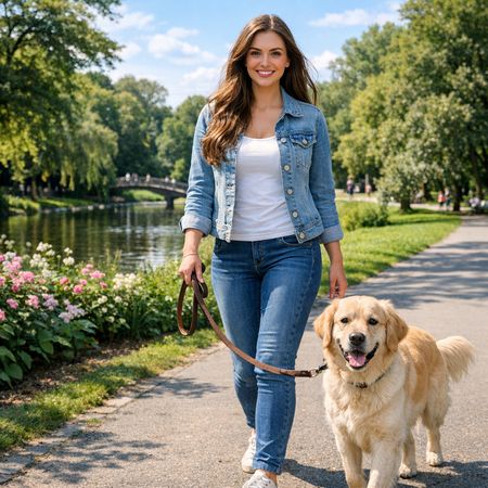
FLUX.2 [klein] 4B
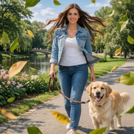
FLUX.2 [pro]
AI Judge Analysis
FLUX.2 [klein] 4B
- + Excellent preservation of the original image's identity and background.
- + Added leaves are small and naturally integrated into the scene's depth.
- + Subtle wind effect on the hair looks realistic and fits the original lighting.
- − The 'lively' feel is a bit more restrained compared to the other model.
FLUX.2 [pro]
- + Successfully applied more dramatic motion to the hair and jacket for a high-energy feel.
- + Added green leaves that suggest a fresher breeze and dynamic depth with foreground blurring.
- + Preserved the core elements of the face and dog well.
- − The very large foreground leaves feel a bit artificial/photobashed.
- − Significant changes to the jacket's shape (blowing open) might exceed 'preservation' expectations for some users.
Verdict: Both models followed the instructions well, but FLUX.2 [pro] created a much more dynamic and 'energetic' feel by blowing the woman's jacket and hair more dramatically and adding foreground motion blur. FLUX.2 [klein] 4B is better at maintaining the exact original composition while adding subtle elements, but FLUX.2 [pro] captures the specific spirit of the prompt better.
Vintage Cafe Logo
Text-to-Image“Vintage minimalist restaurant logo for "Caffè Florian", retro cloche dome with steam and "Est. 1720" banner, classic typography, warm brown and cream tones, subtle texture on light background, vector emblem style.”
FLUX.2 [klein] 4B
FLUX.2 [pro]
AI Judge Analysis
FLUX.2 [klein] 4B
- + Strong minimalist vector execution.
- + Good use of the requested banner element.
- + Accurate date and accent mark placement.
- − Misspelled the primary brand name as 'FLAXTION'.
- − Redundant repetition of the registration date below the banner.
- − The steam is rendered as tiny, disconnected shapes.
FLUX.2 [pro]
- + Perfect text rendering for both the brand name and the date.
- + Highly organic and elegant steam design.
- + Superior vector shading and use of the cream-and-brown palette.
- − The circular emblem style was not explicitly requested, though it fits the theme.
- − The texture on the background is very subtle, almost unnoticeable.
Verdict: FLUX.2 [pro] followed the prompt significantly better by correctly spelling 'Caffè Florian' and creating a more sophisticated, balanced emblem. FLUX.2 [klein] 4B failed on a fundamental typography level by hallucinating additional letters and repeating the date unnecessarily.
Apollo 11: Journey to Tranquility
Text-to-Image“Create a clean, modern vector infographic poster about the Apollo 11 mission. NASA-inspired palette (navy, white, muted red, light gray). Flat-vector style, crisp lines, consistent iconography, subtle gradients only. Steps (stop at landing): 1. Launch (Saturn Vicon) 2. Earth Orbit (Earth + orbit ring icon) 3. Translunar (trajectory arc icon) 4. Lunar Orbit (Moon + orbit ring icon) 5. Descent (lunar module descending icon) 6. Landing (lunar module on the surface icon) Small supporting elements (minimal text): • Crew strip: three silhouette icons with only last names: Armstrong, Aldrin, Collins. • Landing site marker: Moon pin labeled "Tranquility" only. Layout constraints: generous margins, large readable labels, clean background with subtle stars. Vector-only, print-poster look, high resolution.”
FLUX.2 [klein] 4B
FLUX.2 [pro]
AI Judge Analysis
FLUX.2 [klein] 4B
- + Clean vector illustration style.
- + Effective use of the requested NASA-inspired color palette.
- + Includes the requested name labels for astronauts.
- − Text rendering is mostly gibberish (e.g., 'APLLO 1UT 1J').
- − Layout is disorganized and doesn't follow a logical timeline.
- − Missed many of the specific sequence steps requested.
FLUX.2 [pro]
- + Excellent typography with mostly correct spelling for section titles.
- + Logical infographic flow that follows the mission steps from top to bottom.
- + Superior iconography that clearly represents orbital mechanics and the lunar module.
- − Body text beneath headings is nonsensical.
- − The rocket icon looks more like a generic shuttle than the Saturn V specified.
Verdict: FLUX.2 [pro] is the clear winner as it successfully organized the prompt's steps into a logical, vertical infographic flow with significantly better text rendering. While FLUX.2 [klein] 4B captured the requested art style, its layout was chaotic and the main heading was misspelled, making it less effective as an informational poster.
Next steps
Explore each model
Black Forest Labs' state-of-the-art image generation model with maximum quality and speed, supporting text-to-image and multi-reference image editing with up to 4MP output