

Black Forest Labs' open-weights image generation model with frontier performance, available for non-commercial local deployment
Settled by community votes across 8 shared challenges, with an AI judge weighing in on each.
FLUX.2 [dev]
24.8
arena score
#19 of 62 in Text-to-Image
Skill signature
· Text-to-Image
Reve Image 1.0
20.1
arena score
#50 of 62 in Text-to-Image
Vote tally
Where the votes landed
FLUX.2 [dev]
100.0%
win rate
Ties
0.0%
Reve Image 1.0
0.0%
win rate
100.0%
0.0% ties
0.0%
Shared challenges
8
Challenge by challenge
The strongest take from each model on every shared challenge, with the AI judge's read.
Geometric Composition
Text-to-Image“A glass cube on a wooden table. Inside the cube is a small blue sphere. On top of the cube sits a red book. A green plant is behind the cube, partially visible through the glass. Soft window light from the left.”
FLUX.2 [dev]
Reve Image 1.0
100% wins
0% ties
0% wins
AI Judge Analysis
FLUX.2 [dev]
- + Excellent adherence to the glass block/cube physics with realistic thick edges.
- + Superior lighting and soft shadows that feel natural to the environment.
- + Great rendering of the plant's visibility and refraction through the glass.
- − The sphere technically appears to be floating inside the cube rather than resting on the bottom.
- − The book texture is slightly simplified compared to paper.
Reve Image 1.0
- + Clean, modern aesthetic with sharp geometric lines.
- + Good prompt adherence regarding the placement of all objects.
- + Interesting use of blue tinted glass that complements the sphere.
- − The plant is behind the cube but not clearly visible through the glass as requested (it is mostly behind the plant pot/base).
- − Physics issue where the sphere is floating in the center of the cube without support.
- − Noticeable AI artifacting on the left edge of the wood grain.
Verdict: FLUX.2 [dev] produces a much more realistic and cohesive image with superior lighting and refraction physics. While both models struggled with gravity—making the blue sphere float inside the cube—FLUX.2 [dev] followed the instruction to show the plant through the glass much more effectively than Reve Image 1.0.
Fantasy Warrior
Text-to-Image“Close portrait of a battle-worn paladin in ornate engraved plate armor, hair braided with small beads, faint scars and dirt on the skin, warm torchlight reflecting off metal, shallow depth of field, bokeh sparks, lifelike eyes, highly detailed texture on leather straps and cloth underlayer.”
FLUX.2 [dev]
Reve Image 1.0
100% wins
0% ties
0% wins
AI Judge Analysis
FLUX.2 [dev]
- + Excellent adherence to the 'battle-worn' descriptor with visible scars and dirt.
- + Very detailed texture on leather straps and metal engravings.
- + Superior lighting and depth of field, with realistic warm reflections on the armor.
- − The braided beads felt a bit more like a modern accessory style compared to the rest of the armor.
Reve Image 1.0
- + Intricate engraving on the armor which feels very thick and ornate.
- + Good use of bokeh and torchlight background elements.
- − The character's face looks very young and clean, failing the 'battle-worn' requirement.
- − The beads in the hair look slightly metallic and repetitive, lacking the organic feel of beads.
- − Skin lacks the 'lifelike' texture and scarring detail present in the other model.
Verdict: FLUX.2 [dev] is the clear winner as it successfully captured the 'battle-worn' aesthetic with realistic scars, dirt, and lifelike skin textures. In contrast, Reve Image 1.0 produced a character that looks like a teenager in armor, missing the veteran paladin vibe requested in the prompt. FLUX.2 [dev] also handled the lighting and material textures like leather and weathered metal much more convincingly.
Bald man challenge
Image EditingEdit instruction
“Give the person a full, thick head of natural hair with realistic texture, density, and a natural hairline. Preserve facial features and lighting.”

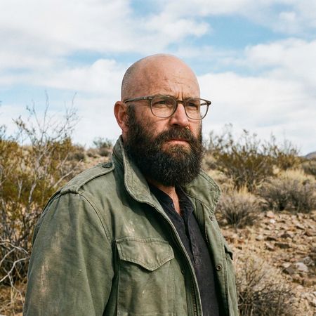
FLUX.2 [dev]
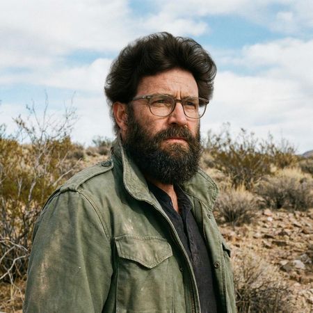
Reve Image 1.0
AI Judge Analysis
FLUX.2 [dev]
- + Excellent preservation of the original face, clothes, and background.
- + High-density hair texture with realistic frizzed edges.
- − The choice of an afro-style hair texture might be seen as less 'natural' for the specific facial hair type provided in the source image.
Reve Image 1.0
- + Great preservation of facial features and lighting.
- + The hair style and texture feels more harmonious with the existing beard and ethnicity of the subject.
- − The hairline transition on the forehead is a bit sharp.
- − The volume of the hair looks slightly pasted on rather than fully integrated into the scalp geometry.
Verdict: Both models did an excellent job of preserving the source image's identity, lighting, and background. FLUX.2 [dev] provides a very high-quality texture but opted for a very large afro style, whereas Reve Image 1.0 provided a more culturally and visually consistent hairstyle for the subject, making it feel slightly more realistic in context.
Isometric Miniature Diorama Scenes
Text-to-Image“Create a clear, 45° top-down isometric miniature 3D cartoon scene of Japan's signature dish: sushi, with soft refined textures, realistic PBR materials, gentle lighting, on a small raised diorama base with minimal garnish and plate. Solid light blue background. At top-center: 'JAPAN' in large bold text, 'SUSHI' below it, small flag icon. Perfectly centered, ultra-clean, high-clarity, square format.”
FLUX.2 [dev]
Reve Image 1.0
AI Judge Analysis
FLUX.2 [dev]
- + Excellent PBR materials with realistic textures on the fish and rice.
- + Clean, professional typography and accurate flag placement.
- + Strong adherence to the 45-degree isometric perspective and diorama request.
- − The 'JAPAN' text is slightly off-center compared to the rest of the logo stack.
Reve Image 1.0
- + Bright, playful cartoon aesthetic.
- + Good centering of the main 3D object.
- − Failed to place 'SUSHI' below 'JAPAN', instead placing them side-by-side.
- − Textures are overly simplistic plasticky blobs rather than refined PBR materials.
- − The flag icon is integrated into the text line rather than being a separate element as implied.
Verdict: FLUX.2 [dev] followed the prompt instructions with much higher precision, delivering the requested PBR materials and professional layout. In contrast, Reve Image 1.0 struggled with the text spatial requirements and produced a much lower-fidelity image that lacked the 'refined textures' requested.
Over-the-top cartoon caricature
EditingEdit instruction
“Create a caricature of me and my job. Make it exaggerated and humorous, incorporating my profession as a tv show anchor and my love for dogs and hockey.”
Source
FLUX.2 [dev]
Reve Image 1.0
AI Judge Analysis
FLUX.2 [dev]
- + Excellent caricature style with classic hand-drawn line work and shading.
- + Includes multiple dogs and detailed hockey elements like a rink background and jerseys.
- + Preserves the subject's facial features accurately within the caricature medium.
- − Text on the desk is unintelligible gibberish.
- − The extra man in the background is a bit distracting and wasn't requested.
Reve Image 1.0
- + Highly vibrant and polished digital art style.
- + Strong adherence to all prompt elements: anchor desk, hockey jersey, hockey stick, and a dog helper.
- + Very clear and readable 'NEWS' text.
- − The caricature effect is less 'exaggerated' and feels more like a 3D filter.
- − The dog has five toes on its left front paw.
Verdict: FLUX.2 [dev] delivers a much more authentic caricature experience, capturing the classic artistic style and incorporating the hockey theme into the background environment and the dogs' outfits. Reve Image 1.0 is cleaner and more colorful with better text rendering, but it feels less like a traditional caricature and has some minor anatomical errors on the dog.
Studio Ghibli Anime Style
EditingEdit instruction
“Transform this photo into a Studio Ghibli–inspired illustration. Use soft pastel colors, hand-painted textures, gentle lighting, dreamy backgrounds, and a warm, nostalgic mood”
Source
FLUX.2 [dev]
Reve Image 1.0
AI Judge Analysis
FLUX.2 [dev]
- + Excellent soft, dreamy color palette
- + High-quality linework and shading
- + Successfully transforms the urban environment into a whimsical floral background
- − Character faces lack the specific Ghibli facial features
- − The woman in the foreground's expression is a bit too blank and neutral
Reve Image 1.0
- + Captures the specific Studio Ghibli character design style perfectly
- + Preserves the original street composition and background elements well
- + Expressive facial features that match the source image's mood
- − The foreground blur is a bit heavy, losing texture detail
- − Linework is slightly rougher in some areas compared to Model A
Verdict: Reve Image 1.0 is the winner because it successfully captures the specific 'Studio Ghibli' aesthetic in the character faces and line style, whereas FLUX.2 [dev] looks more like a generic modern manhwa or soft digital illustration. While FLUX.2 created a beautiful atmosphere, Reve Image 1.0 followed the stylistic prompt more accurately while maintaining the original meme's funny character expressions.
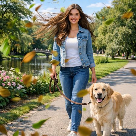
Golden Hour Stroll
Image EditingEdit instruction
“Add dynamic motion to this photo: make hair blow in the wind, add leaves flying, energetic and lively feel.”
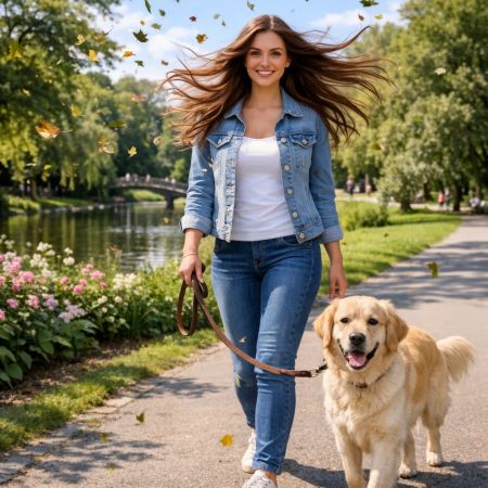
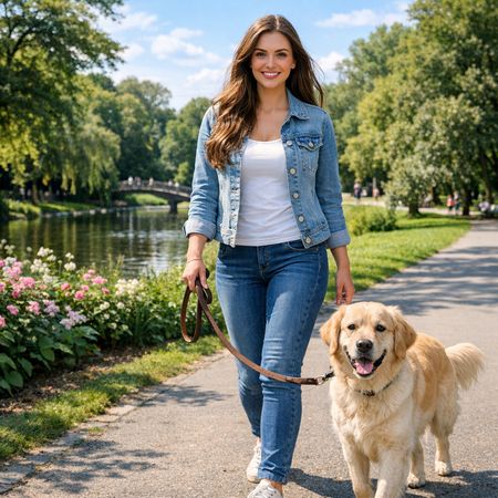
FLUX.2 [dev]
Reve Image 1.0
AI Judge Analysis
FLUX.2 [dev]
- + Excellent source preservation, maintaining identical facial features and background details
- + Subtle and natural-looking hair motion that flows realistically from the head
- + Adds a high quantity of crisp, well-defined falling leaves
- − The wind direction for the hair and the leaves seems slightly inconsistent
- − The hair edit has some minor transparency artifacts where the strands meet the background
Reve Image 1.0
- + Stronger sense of motion with blurred foreground leaves and wind-swept hair
- + Dynamic composition using depth of field with blurred leaves in the foreground
- + Better directional consistency between the hair movement and the leaves
- − Noticeable distortion of the woman's face compared to the source image
- − Some leaves appear to be floating or stuck awkwardly to the woman's denim jacket
Verdict: Both models successfully interpreted the dynamic motion prompt, but they took different approaches to source preservation. FLUX.2 [dev] did an incredible job keeping the original identity and background perfectly intact while adding elements, whereas Reve Image 1.0 captured a more cinematic and intense feeling of movement through motion blur at the expense of altering the woman's face and adding some messy artifacts on the clothing.
Apollo 11: Journey to Tranquility
Text-to-Image“Create a clean, modern vector infographic poster about the Apollo 11 mission. NASA-inspired palette (navy, white, muted red, light gray). Flat-vector style, crisp lines, consistent iconography, subtle gradients only. Steps (stop at landing): 1. Launch (Saturn Vicon) 2. Earth Orbit (Earth + orbit ring icon) 3. Translunar (trajectory arc icon) 4. Lunar Orbit (Moon + orbit ring icon) 5. Descent (lunar module descending icon) 6. Landing (lunar module on the surface icon) Small supporting elements (minimal text): • Crew strip: three silhouette icons with only last names: Armstrong, Aldrin, Collins. • Landing site marker: Moon pin labeled "Tranquility" only. Layout constraints: generous margins, large readable labels, clean background with subtle stars. Vector-only, print-poster look, high resolution.”
FLUX.2 [dev]
Reve Image 1.0
AI Judge Analysis
FLUX.2 [dev]
- + Excellent vector art style with high-quality shading and lighting effects.
- + Includes creative additions of the astronaut's names in a modern UI style.
- + Clear, detailed icons for the Saturn V and the Lunar Module.
- − The sequence is disorganized and does not follow a logical 1-6 flow.
- − Several text elements are garbled or nonsensical (e.g., 'UALSIST ORDIT').
Reve Image 1.0
- + Clean, minimalist flat-vector aesthetic that adheres well to a modern infographic style.
- + Correctly numbered sequence that follows the logical stages of the mission.
- + Good use of the requested NASA-inspired color palette.
- − Several spelling errors in primary text labels (e.g., 'Anmlot', 'Dessent', 'Lunnr').
- − The Saturn V icon lacks the red accents used elsewhere in the design.
Verdict: FLUX.2 [dev] produces much higher quality individual icons and a more professional aesthetic, though it struggles with text and logical layout. Reve Image 1.0 follows the requested infographic structure and numbering more accurately but suffers from significant spelling errors and simpler, less polished graphics. FLUX.2 [dev] is the preferred choice for its superior visual fidelity, despite the chaotic layout of the steps.
Next steps
Explore each model
Reve AI's text-to-image generation model with strong aesthetic quality, accurate text rendering, and detailed instruction following capabilities