Grok Imagine Image vs Wan 2.6
Head-to-head across 13 challenges
Grok Imagine Image
51.9%
win rate
Ties
7.4%
Wan 2.6
40.7%
win rate
Challenge Results
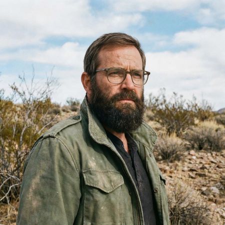
Man and Car in California
Editing“Make a photo of the man driving the car down the California coastline”
AI Judge Analysis
Grok Imagine Image
- + Excellent preservation of the car's model and specific design details
- + High visual quality with realistic motion blur and lighting
- + Successfully replaces the entire environment with a convincing California coastline
- − Completely failed to include the man from the second source image, using a generic placeholder instead
Wan 2.6
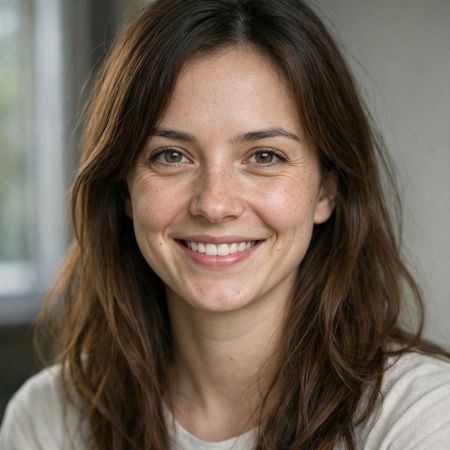
- + Excellent character preservation, accurately incorporating the specific man and his clothing from the source image
- + Strong composition that places the subject and car naturally within the requested environment
- + Maintains the luxury convertible aesthetic of the original car
- − The car model changed slightly from the original (interior dashboard and grilles are different)
Verdict: Wan 2.6 is the clear winner because it successfully integrated both source images by placing the specific man from the second image into the car from the first. Grok Imagine ignored the second source image entirely, rendering a generic driver that did not resemble the requested person.
Modern Clean Menu
Text-to-Image“Modern minimalist restaurant menu design, white background with colorful food photos in grid, sections for appetizers/pizza/mains, bold sans-serif fonts, vibrant accents, clean professional layout for casual dining.”
AI Judge Analysis
Grok Imagine Image
- + Strictly followed the category requirements for Appetizers, Pizza, and Mains.
- + Excellent usage of white space and professional sans-serif typography.
- + Sophisticated integration of food photography with the layout, using varying crops and positions.
- − Considerable amount of text repetition and gibberish in the item descriptions.
- − The 'Pizza' section contains several items that are clearly not pizzas (e.g., Steak Frites).
Wan 2.6
- + Successfully implemented the 'grid' layout requested in the prompt.
- + Higher quality, more realistic food photography with consistent lighting.
- + Includes pricing details which adds to the realism of a restaurant menu.
- − Failed to include a dedicated 'Appetizers' list, only having a heading above pizza photos.
- − Significant text rendering issues including garbled letters and nonsensical prices (e.g., $0.09).
- − Overall layout feels more like a flyer or advertisement than a functional menu.
Verdict: Grok Imagine Image followed the structural requirements of the prompt much better, providing distinct sections for all three requested categories and maintaining a clean, professional aesthetic. While Wan 2.6 has superior photographic quality and followed the 'grid' instruction, the actual content of the menu is disorganized and fails to provide the requested variety of food sections. Grok Imagine Image is the winner for its better adherence to the complex layout and categorization instructions.
Bald man challenge
Editing“Give the person a full, thick head of natural hair with realistic texture, density, and a natural hairline. Preserve facial features and lighting.”
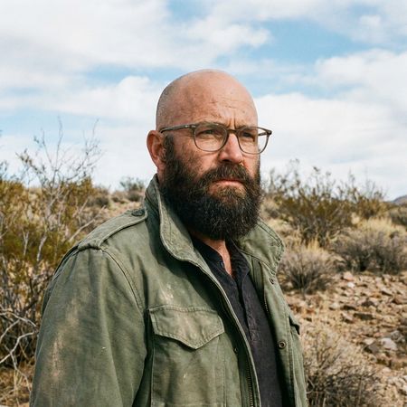
AI Judge Analysis
Grok Imagine Image
- + Excellent source preservation, keeping the face and background identical.
- + Very natural and believable hair texture and density.
- + Matches the hair color and lighting of the existing beard perfectly.
- − The hair is a bit thin in the front compared to the 'thick' request, though more realistic.
Wan 2.6
- + Successfully added a very thick and full head of hair as requested.
- + Good integration of the hair with the sideburns and beard.
- − Subtly altered facial features, making the person look younger and changing the eye area.
- − The hair thickness looks slightly artificial/wig-like along the top edge.
Verdict: Grok Imagine Image provides a much more successful edit by perfectly preserving the original person's identity and facial structure while adding realistic hair. Wan 2.6 followed the 'thick' instruction more aggressively but at the cost of altering the subject's face and original character.
Isometric Miniature Diorama Scenes
Text-to-Image“Create a clear, 45° top-down isometric miniature 3D cartoon scene of Japan's signature dish: sushi, with soft refined textures, realistic PBR materials, gentle lighting, on a small raised diorama base with minimal garnish and plate. Solid light blue background. At top-center: 'JAPAN' in large bold text, 'SUSHI' below it, small flag icon. Perfectly centered, ultra-clean, high-clarity, square format.”
AI Judge Analysis
Grok Imagine Image
- + Perfect adherence to the 45-degree isometric perspective and diorama base request.
- + Excellent text rendering and layout with consistent font and centered flag icon.
- + Higher variety and density of sushi models while maintaining a clean aesthetic.
- − The lighting is a bit harsh with very dark, sharp shadows compared to the 'gentle' request.
- − The plate cuts off slightly at the edge of the blue base.
Wan 2.6
- + Beautiful soft lighting and 'gentle' shadows that match the prompt perfectly.
- + High-quality PBR-like materials, especially on the wooden board and wasabi texture.
- + Very clean and modern graphic design for the text and flag.
- − The camera angle is slightly lower than the requested 45-degree top-down isometric view.
- − Text placement is a bit tight with the flag squeezed next to 'SUSHI' rather than being a separate small element.
Verdict: Both models followed the prompt well, but Grok Imagine Image (Model A) captured the specific '45-degree isometric' look and 'diorama' feel more accurately. While Wan 2.6 (Model B) had superior soft lighting and material textures that felt more premium, Model A's composition and precise adherence to the requested layout make it the winner for this specific challenge.
Night Sky Transformation
Editing“Change the scene to night: a deep, dark sky with subtle, glistening stars visible behind the mountain.”
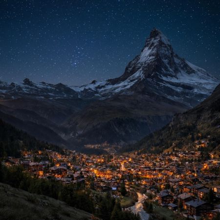
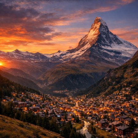
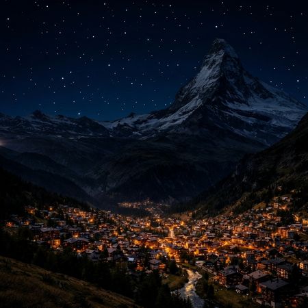
AI Judge Analysis
Grok Imagine Image
- + Excellent source preservation, maintaining the exact structures and topography.
- + Realistic star density and atmospheric glow near the horizon.
- + Natural color grading that captures a convincing night-to-dawn transition.
- − The sky is slightly brighter than a 'deep, dark sky' might suggest.
Wan 2.6
- + Successfully creates a very deep, dark sky as requested.
- + Perfectly preserves the composition and details of the original village and mountain.
- − The stars appear as uniform, sharp white dots that lack natural variance and atmospheric twinkling.
- − Slightly more 'pasted on' look to the star field compared to the atmospheric original image.
Verdict: Both models did an exceptional job of preserving the source image while applying the requested night-time edit. Grok Imagine feels more atmospheric and natural, with stars that blend realistically into the sky, while Wan 2.6 better captured the request for a 'deep, dark sky' but with less realistic, more uniform star renderings.
Over-the-top cartoon caricature
Editing“Create a caricature of me and my job. Make it exaggerated and humorous, incorporating my profession as a tv show anchor and my love for dogs and hockey.”
AI Judge Analysis
Grok Imagine Image
- + Retains an incredible facial resemblance to the woman in the source image.
- + Successfully interprets the 'caricature' style with the classic big-head/small-body aesthetic.
- + Perfectly integrates all requested themes: TV news desk, hockey rink background, and dogs with hockey gear.
- − The hockey stick in the dog's mouth is slightly warped.
- − The transition between the photographic face and the illustrated body is a bit jarring.
Wan 2.6
- + Strong, cohesive illustrative art style across the entire image.
- + Creative inclusion of a secondary dog (pug) in a hockey jersey.
- + Clear depiction of all requested elements: TV anchor equipment, dogs, and hockey gear.
- − Loses the specific facial likeness of the source image, looking like a generic cartoon character.
- − The left hand holding the hockey stick is anatomicaly awkward relative to the arm position.
Verdict: Grok Imagine Image is the superior choice because it successfully maintains the identity of the person in the source image, transforming her face into a recognizable caricature. While Wan 2.6 creates a fun illustration, it fails the 'caricature of me' aspect by replacing the user with a generic cartoon character. Grok's inclusion of specific details like the 'Sports Scoop' papers and the dogs on ice skates makes for a more clever interpretation of the prompt.
Victorian Greenhouse Oasis
Text-to-Image“Hyper-photorealistic interior of a lush Victorian glass greenhouse filled with exotic tropical plants, vibrant blooming orchids, tall ferns, colorful butterflies in flight, sunlight filtering through ornate glass roof creating realistic caustics and dew on leaves, intricate iron framework visible, misty atmosphere, 8K masterpiece.”
AI Judge Analysis
Grok Imagine Image
- + Excellent depiction of broad tropical foliage and oversized leaves.
- + Dramatic lighting with strong volumetric god rays.
- + Clean, sharp rendering of the Victorian ironwork.
- − The butterflies look like flat, artificial stickers placed on top of the image.
- − Lacks the 'misty' atmosphere requested in the prompt.
- − Orchids are sparse compared to the overall foliage.
Wan 2.6
- + Successfully captures the requested misty, humid atmosphere.
- + Exceptional orchid variety and placement, following the 'vibrant blooming orchids' prompt well.
- + Highly realistic dew drops on the leaves and visible caustics on the floor.
- + More natural integration of butterflies into the 3D space.
- − The composition is a bit more 'busy' with less focus on individual large plants.
- − Some butterfly wing shapes are slightly distorted (AI artifacts).
Verdict: Wan 2.6 is the clear winner as it more accurately captures the complex atmosphere requested, including the mist, dew, and specific floral density. While Grok Imagine produced a high-quality architectural render, its butterflies feel like 2D overlays and it missed the subtle environmental details like dew and caustics that Wan 2.6 rendered beautifully.
Studio Ghibli Anime Style
Editing“Transform this photo into a Studio Ghibli–inspired illustration. Use soft pastel colors, hand-painted textures, gentle lighting, dreamy backgrounds, and a warm, nostalgic mood”
AI Judge Analysis
Grok Imagine Image
- + Captures the iconic Studio Ghibli 'painted' background style with fluffy white clouds and blue skies.
- + Maintains high character fidelity, accurately preserving the poses, expressions, and clothing of the original meme.
- + The color palette is vibrant yet warm, consistent with Ghibli's summer-themed films.
- − The line art on the characters is a bit thin compared to the classic bold Ghibli linework.
- − The man's facial features feel slightly more generic than the source's expressive pout.
Wan 2.6
- + Successfully applies a beautiful watercolor 'wash' texture across the entire image.
- + Excellent hand-drawn aesthetic with soft, expressive line art.
- + The lighting is very gentle and dreamy, perfectly matching the 'soft pastel' request.
- − The addition of white bokeh/sparkle dots feels more like generic shoujo anime than specific Ghibli style.
- − The background is very washed out and loses the architectural detail present in the source.
- − The transition between the man's arm and the woman on the right is slightly messy.
Verdict: Grok Imagine Image is the winner because it perfectly balances the requested Studio Ghibli aesthetic with excellent source preservation. It maintains the specific layout, expressions, and colors of the original 'distracted boyfriend' meme while transforming the environment into a rich, hand-painted Ghibli world. Wan 2.6 provides a beautiful watercolor illustration, but it loses too much background detail and adds distracting sparkles that deviate from the Ghibli art style.
Neutral Expression to Genuine Smile
Editing{
"action": "image_edit",
"reference": "uploaded neutral portrait",
"change": "Warm genuine Duchenne smile: lips curved up, slight natural teeth, soft eye crinkles, subtle cheek raise",
"details": "Realistic smiling skin (dimples if present, soft cheek shadows), slightly brighter eyes; keep exact eye shape/color/iris",
"preserve_exact": "Face identity/structure, eyes/nose/lips/eyebrows, hair, skin texture/pores/freckles, makeup, clothing, head pose, background, lighting, shadows, framing",
"no_changes": "No face shape change, no new features, no gaze shift, no hair/clothing/lighting/background edits",
"style": "Ultra-photorealistic 8K portrait, sharp face focus, natural soft lighting, realistic skin glow"
}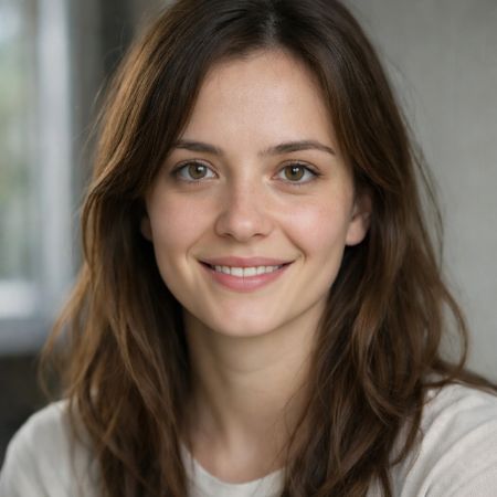
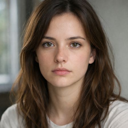
AI Judge Analysis
Grok Imagine Image
- + Excellent preservation of skin texture and freckles from the original.
- + Subtle and natural smiling expression that doesn't distort the face.
- + Maintains the exact hair structure and background without changes.
- − The smile is a bit reserved and lacks the requested 'soft eye crinkles' for a full Duchenne effect.
- − The teeth rendering is a bit blurry compared to the rest of the image.
Wan 2.6
- + Perfectly captures the 'Duchenne smile' with natural eye crinkles and raised cheeks.
- + Highly realistic teeth and mouth structure while maintaining the original lip shape.
- + Incredible detail in skin folds around the eyes and mouth that feel authentic to the expression.
- − Slightly alters the nose shape (making it appear wider/flatter) compared to the source.
Verdict: Both models performed exceptionally well at preserving the identity and technical details of the source image. Wan 2.6 is the winner because it more accurately captured the specific nuances of a Duchenne smile, including the necessary eye crinkles and cheek raises, whereas Grok Imagine Image provided a more static, 'posed' smile that didn't fully engage the eyes.
Intricate Floral Mandala
Text-to-Image“Perfectly symmetrical mandala made entirely of real flowers, petals, leaves, fruits, and seeds in vibrant natural colors, intricate layered patterns with radial symmetry, top-down view on a soft neutral background, hyper-detailed organic textures and subtle shadows, photorealistic, 8K masterpiece.”
AI Judge Analysis
Grok Imagine Image
- + Vibrant and rich color palette with high visual impact.
- + Excellent variety of organic materials including berries, seeds, and diverse petals.
- + Intricate layering that fills the entire frame effectively.
- − Symmetry is noticeably imperfect, especially in the outer corners and the alignment of the central star.
- − The textures on some leaves appear a bit flat and less photorealistic compared to the other elements.
Wan 2.6
- + Exceptional adherence to 'perfectly symmetrical', with precise radial alignment of all elements.
- + Highly realistic texture on the background fabric and individual organic components.
- + Clean, elegant composition that feels like a real, hand-placed floral arrangement.
- − The arrangement is more simplistic and less 'intricate' than Model A.
- − Includes a large shadow in the top right corner that slightly distracts from the clean background requested.
Verdict: Grok Imagine Image offers a more complex and visually densest interpretation with a wide array of organic textures, but it struggles with the 'perfectly symmetrical' part of the prompt. Wan 2.1 delivers a much more precise radial symmetry and realism, feeling like a genuine photograph of curated items, even if it is slightly less adventurous in its material layering. Wan 2.1 is preferred for its technical accuracy in composition and superior photorealistic quality.
Golden Hour Stroll
Editing“Add dynamic motion to this photo: make hair blow in the wind, add leaves flying, energetic and lively feel.”
AI Judge Analysis
Grok Imagine Image
- + Excellent source preservation of the woman and dog
- + Highly energetic feel with numerous leaves
- − Leaves look like floating stickers rather than being part of the environment
- − Dog's ears are slightly distorted to simulate movement
Wan 2.6
- + Natural looking wind effect on the hair
- + Leaves are integrated realistically with motion blur
- + Near-perfect preservation of the original image details
- − Fewer leaves make the scene feel slightly less 'energetic' than instructed
Verdict: Grok Imagine followed the prompt by adding a very large amount of leaves, but they look like a flat overlay over the original image. Wan 2.6 provided a much more subtle and realistic edit, with hair that flows naturally and leaves that have appropriate motion blur, making it the superior technical edit.
Vintage Cafe Logo
Text-to-Image“Vintage minimalist restaurant logo for "Caffè Florian", retro cloche dome with steam and "Est. 1720" banner, classic typography, warm brown and cream tones, subtle texture on light background, vector emblem style.”
AI Judge Analysis
Grok Imagine Image
- + Excellent typography with proper accent on 'Caffè'
- + Superior vector-style illustration with clean linework
- + Accurate rendering of the requested text elements
- − Repeats the 'Est. 1720' text twice, which wasn't specifically requested
- − Includes some ambiguous shapes behind the cloche
Wan 2.6
- + Good use of the requested banner element for the date
- + Pleasant vintage border texture on the background
- + Simple and clear composition
- − Text rendering for 'Caffè' uses a generic font and is slightly poorly spaced
- − The cloche illustration is less refined and feels more like clip-art
Verdict: Grok Imagine Image provides a much more professional-grade logo with superior typography and high-quality vector illustrations that feel like a real brand identity. While Wan 2.6 follows the banner instruction well, the overall execution lacks the polish and typographic elegance found in the Grok output.
Apollo 11: Journey to Tranquility
Text-to-Image“Create a clean, modern vector infographic poster about the Apollo 11 mission. NASA-inspired palette (navy, white, muted red, light gray). Flat-vector style, crisp lines, consistent iconography, subtle gradients only. Steps (stop at landing): 1. Launch (Saturn Vicon) 2. Earth Orbit (Earth + orbit ring icon) 3. Translunar (trajectory arc icon) 4. Lunar Orbit (Moon + orbit ring icon) 5. Descent (lunar module descending icon) 6. Landing (lunar module on the surface icon) Small supporting elements (minimal text): • Crew strip: three silhouette icons with only last names: Armstrong, Aldrin, Collins. • Landing site marker: Moon pin labeled "Tranquility" only. Layout constraints: generous margins, large readable labels, clean background with subtle stars. Vector-only, print-poster look, high resolution.”
AI Judge Analysis
Grok Imagine Image
- + Successfully included all six requested infographic steps with corresponding icons.
- + Followed the color palette and flat-vector style perfectly.
- + Text and labels are mostly legible and properly arranged.
- − Contains minor AI spelling artifacts in the secondary text (e.g., '3rajoory', 'Moom').
- − The Saturn V icon is generic rather than realistic.
Wan 2.6
- + Clean, minimalist aesthetic with clear text rendering.
- + Good use of white space and profile silhouettes for the crew.
- − Complete failure to follow the core instruction of creating a 6-step infographic.
- − Missed all specific icons requested (Saturn V, orbit rings, trajectory arc, lunar module).
- − Lacks the complex informational density required by the prompt.
Verdict: Grok Imagine followed the complex prompt instructions near-perfectly, creating a detailed 6-step infographic with the requested icons and NASA-inspired color scheme. In contrast, Wan 2.6 failed to generate an infographic at all, producing a simple poster with only the crew names and none of the requested technical steps or specific icons.
Grok Imagine Image
An image generation model by xAI designed to generate highly aesthetic images from text descriptions.
Wan 2.6
Alibaba's text-to-image generation model from the Wan AI suite, supporting both Chinese and English prompts with optional reference image guidance for style