FLUX.2 [pro] vs Wan 2.6
Head-to-head across 10 challenges
FLUX.2 [pro]
56.5%
win rate
Ties
4.3%
Wan 2.6
39.1%
win rate
Challenge Results
Man and Car in California
Editing“Make a photo of the man driving the car down the California coastline”
AI Judge Analysis
FLUX.2 [pro]
- + Excellent preservation of the specific Rolls-Royce model design
- + Highly realistic integration of the man into the driver's seat
- + Accurate depiction of the California coastline with realistic lighting
- − The man's clothing is simplified compared to the source image
- − The car is positioned on the wrong side of the road for a standard US coastline drive
Wan 2.6
- + Successfully captures more of the man's original outfit, including the scarf and patterned coat
- + Dynamic composition with a beautiful coastal vista
- + Good handle on motion blur for the wheels and road
- − Significant distortion of the Rolls-Royce's body shape and proportions
- − Inaccurate steering wheel and dashboard compared to the source car
Verdict: FLUX.2 [pro] is the winner because it maintains the integrity of the source image of the car almost perfectly while placing it in a realistic environment with the subject correctly seated. While Wan 2.6 does a better job of preserving the man's specific fashion from the second source image, it heavily distorts the vehicle's geometry, turning the Rolls-Royce into a generic-looking convertible.
Modern Clean Menu
Text-to-Image“Modern minimalist restaurant menu design, white background with colorful food photos in grid, sections for appetizers/pizza/mains, bold sans-serif fonts, vibrant accents, clean professional layout for casual dining.”
AI Judge Analysis
FLUX.2 [pro]
- + Excellent typography with clean, legible sans-serif fonts
- + Professional two-column layout that feels like a real functional menu
- + Accurate sections for appetizers, pizza, and mains (MINS)
- − The food photos in the grid don't always match the labels (e.g., steak under pizza label)
- − Minor spelling error on 'MINS' instead of 'MAINS'
Wan 2.6
- + Very vibrant and colorful graphic design elements
- + High-quality, appetizing food photography in a consistent grid
- + Good use of color blocking to define sections
- − Text rendering is poor with significant gibberish and artifacts
- − Layout is a bit cluttered with overlapping lines and inconsistent spacing
- − Currency symbols and pricing are nonsensical
Verdict: FLUX.2 [pro] is the superior choice because it produces a functional, realistic menu layout with mostly legible text and clear organization. While Wan 2.6 has more vibrant photography and creative border accents, its text is largely illegible and the overall composition lacks the professional hierarchy requested in the prompt.
Bald man challenge
Editing“Give the person a full, thick head of natural hair with realistic texture, density, and a natural hairline. Preserve facial features and lighting.”

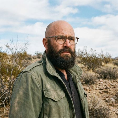
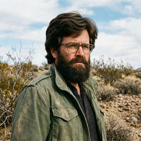
AI Judge Analysis
FLUX.2 [pro]
- + Natural hair texture that matches the existing beard color and age of the man
- + Good integration with the temples and sideburns
- + Maintains high facial fidelity to the source image
- − Significantly altered the color and shape of the beard and mustache
- − The hairline looks slightly artificial where it meets the forehead
Wan 2.6
- + Excellent preservation of the original beard and facial features
- + Impressive hair volume and realistic wavy texture
- + Seamless integration of the hair with the existing sideburns
- − Hair color is much darker than the beard, creating a slightly mismatched look
Verdict: Wan 2.6 is the winner because it successfully added a full head of hair while perfectly preserving the person's face and original beard. Flux.2 Pro successfully added the hair but unnecessarily modified the beard, changing the character's appearance more than requested.
Night Sky Transformation
Editing“Change the scene to night: a deep, dark sky with subtle, glistening stars visible behind the mountain.”
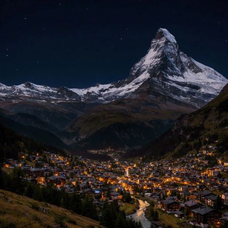
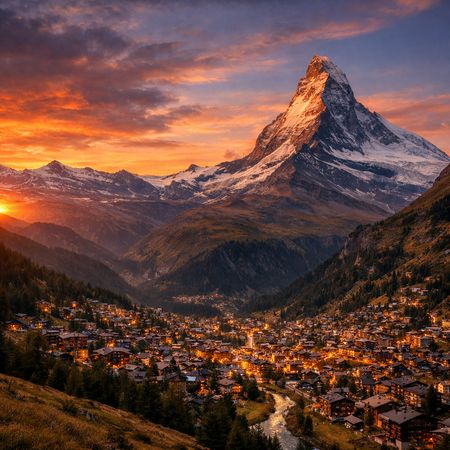
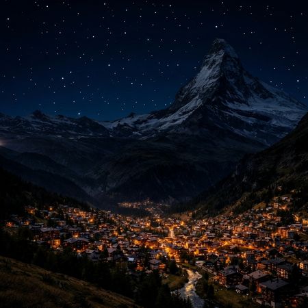
AI Judge Analysis
FLUX.2 [pro]
- + Excellent source preservation, keeping the town layout and mountain textures identical.
- + Realistically adjusts the lighting on the mountain peak to reflect a moonlit or night ambiance.
- + Subtle, natural-looking stars that don't overwhelm the scene.
Wan 2.6
- + Successfully transitions the sky to a deep night color.
- + Maintains the core composition of the original image well.
- − The stars appear like a uniform, artificial grid of dots rather than natural celestial bodies.
- − Loses some definition and lighting realism on the mountain face compared to the light source logic.
Verdict: FLUX.2 [pro] is the winner as it perfectly preserves the fine details of the original village and mountain while masterfully shifting the lighting to a realistic nighttime atmosphere. Wan 2.6 succeeds in changing the sky color, but the stars look like a procedurally generated pattern of white dots, which reduces the overall quality of the edit.
Over-the-top cartoon caricature
Editing“Create a caricature of me and my job. Make it exaggerated and humorous, incorporating my profession as a tv show anchor and my love for dogs and hockey.”
AI Judge Analysis
FLUX.2 [pro]
- + Excellent preservation of the subject's facial features in caricature form.
- + Cleverly integrates all themes into a cohesive TV studio environment.
- + High-quality vector illustration style with clean lines and balanced composition.
- − The hands on the central figure are slightly small relative to the head size.
- − The dogs appear a bit generic compared to the specific subject likeness.
Wan 2.6
- + Successfully incorporates all elements: TV anchor, dogs, and hockey.
- + Good use of studio lighting and background elements to set the scene.
- − The caricature loses some of the specific facial likeness of the source image.
- − Anatomical issues with the pug's hand holding the hockey stick.
- − The hockey stick is abnormally long and thin.
Verdict: FLUX.2 [pro] is the winner because it successfully creates a caricature that actually looks like the person in the source image, whereas Wan 2.6 creates a more generic character. FLUX.2 [pro] also integrates the hockey and dog elements more naturally into the studio desk setting, while Wan 2.6 has some technical flaws in the rendering of the hockey stick and the animals' paws.
Studio Ghibli Anime Style
Editing“Transform this photo into a Studio Ghibli–inspired illustration. Use soft pastel colors, hand-painted textures, gentle lighting, dreamy backgrounds, and a warm, nostalgic mood”
AI Judge Analysis
FLUX.2 [pro]
- + Perfectly captures the Studio Ghibli art style with thick, clean line art and flat cel-shading.
- + Meticulously preserves the composition, character poses, and background details from the source image.
- + Employs an authentic paper-texture overlay and warm, nostalgic color palette.
- − The faces look a bit more generic than the source, though the expressions are accurate.
Wan 2.6
- + Beautiful watercolor-inspired texture that feels hand-painted.
- + Maintains character likenesses slightly better while still stylizing them.
- + High brightness and soft lens flare create an ethereal, dreamy mood.
- − The art style leans more towards modern shoujo manga or generic watercolor anime than the specific Ghibli aesthetic requested.
- − The white bokeh/sparkle effects feel slightly cluttered compared to the clean source.
Verdict: Both models did an excellent job of translating the 'Distracted Boyfriend' meme into an anime aesthetic. FLUX.2 [pro] is the winner because it adhered much more strictly to the 'Studio Ghibli' instruction, capturing the specific line-weight and background architecture style characteristic of the studio, whereas Wan 2.6 produced a looser watercolor style more reminiscent of generic modern illustration.
Neutral Expression to Genuine Smile
Editing{
"action": "image_edit",
"reference": "uploaded neutral portrait",
"change": "Warm genuine Duchenne smile: lips curved up, slight natural teeth, soft eye crinkles, subtle cheek raise",
"details": "Realistic smiling skin (dimples if present, soft cheek shadows), slightly brighter eyes; keep exact eye shape/color/iris",
"preserve_exact": "Face identity/structure, eyes/nose/lips/eyebrows, hair, skin texture/pores/freckles, makeup, clothing, head pose, background, lighting, shadows, framing",
"no_changes": "No face shape change, no new features, no gaze shift, no hair/clothing/lighting/background edits",
"style": "Ultra-photorealistic 8K portrait, sharp face focus, natural soft lighting, realistic skin glow"
}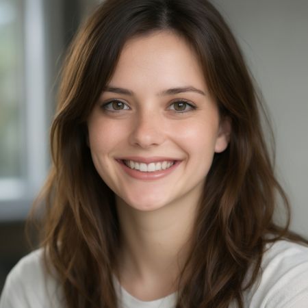
AI Judge Analysis
FLUX.2 [pro]
- + Successfully added a warm smile with natural-looking teeth.
- + Maintained high visual clarity and lighting consistency.
- + Preserved the general aesthetic and color palette of the original.
- − Noticeably smoothed the skin texture, losing the freckles and pores from the source.
- − Lost the Duchenne eye crinkles and subtle skin details requested.
- − Changed the lip shape and philtrum structure significantly.
Wan 2.6
- + Excellent preservation of skin texture, pores, and freckles from the source image.
- + Perfectly captured the Duchenne smile with eye crinkles and cheek raises.
- + Strictly adhered to the request to keep eye shape and identity intact while adding the expression.
- − Slightly altered the chin shape compared to the original, though it remains coherent.
Verdict: Wan 2.6 performed significantly better in this editing task by preserving the fine skin details, such as freckles and pores, while perfectly executing the complex 'Duchenne smile' request. FLUX.2 [pro] smoothed the subject's face excessively, removing the characterizing skin details and failing to add the requested eye crinkles, resulting in a more generic look.
Golden Hour Stroll
Editing“Add dynamic motion to this photo: make hair blow in the wind, add leaves flying, energetic and lively feel.”
AI Judge Analysis
FLUX.2 [pro]
- + Successfully added large, prominent flying leaves with motion blur.
- + Modified the hair significantly to look windswept and energetic.
- + Created an open jacket effect that adds to the feeling of movement.
- − The leaves are slightly oversized and can be distracting from the main subject.
- − Added a slight red bracelet/detail on the wrist that wasn't in the original.
Wan 2.6
- + Excellent hair modification that looks natural yet dynamic.
- + Preserved the face and lighting of the original image with high fidelity.
- + Added subtle falling leaves that integrate well with the background.
- − The flying leaves are very small and sparse compared to the request.
- − The bottom leaf appears to be floating unnaturally compared to the others.
Verdict: FLUX.2 [pro] followed the prompt more aggressively, creating a highly dynamic scene with large flying leaves and a blowing jacket that matches the 'lively' request. Wan 2.6 provided a more subtle and photorealistic edit, with better hair movement but much less impact from the flying leaves.
Vintage Cafe Logo
Text-to-Image“Vintage minimalist restaurant logo for "Caffè Florian", retro cloche dome with steam and "Est. 1720" banner, classic typography, warm brown and cream tones, subtle texture on light background, vector emblem style.”
AI Judge Analysis
FLUX.2 [pro]
- + Perfect adherence to text, including the accent in 'Caffè'.
- + Superior vector emblem composition with a balanced circular frame.
- + Clean, professional typography that fits the 'classic' and 'minimalist' prompt requirements.
- − The 'Est. 1720' banner is a bit simple compared to the rest of the illustration.
Wan 2.6
- + Good use of warm brown tones and highlights on the cloche.
- + Correct spelling of the cafe name and establishment date.
- − The 'Est. 1720' banner is poorly integrated, appearing to stick out of the side of the cloche awkwardly.
- − The background texture is heavy and blotchy, detracting from the 'minimalist' request.
- − Typography is less refined and lacks the professional 'vector emblem' feel of Model A.
Verdict: FLUX.2 [pro] followed the prompt more effectively, producing a well-balanced circular emblem with superior typography and subtle, tasteful background texture. Wan 2.6 struggled with the composition, placing the banner in an awkward position and used a much more distracting background texture that feels less like a professional logo.
Apollo 11: Journey to Tranquility
Text-to-Image“Create a clean, modern vector infographic poster about the Apollo 11 mission. NASA-inspired palette (navy, white, muted red, light gray). Flat-vector style, crisp lines, consistent iconography, subtle gradients only. Steps (stop at landing): 1. Launch (Saturn Vicon) 2. Earth Orbit (Earth + orbit ring icon) 3. Translunar (trajectory arc icon) 4. Lunar Orbit (Moon + orbit ring icon) 5. Descent (lunar module descending icon) 6. Landing (lunar module on the surface icon) Small supporting elements (minimal text): • Crew strip: three silhouette icons with only last names: Armstrong, Aldrin, Collins. • Landing site marker: Moon pin labeled "Tranquility" only. Layout constraints: generous margins, large readable labels, clean background with subtle stars. Vector-only, print-poster look, high resolution.”
AI Judge Analysis
FLUX.2 [pro]
- + Excellent adherence to the multi-step infographic structure.
- + Highly accurate flat-vector style with a clean NASA-inspired palette.
- + Legible main headings and consistent iconography across all six requested steps.
- − Body text beneath headings is nonsensical filler text.
- − The Saturn V icon at the top looks more like a shuttle/generic rocket than the specific Saturn V profile.
Wan 2.6
- + Clean typography for the main title and astronaut names.
- + Good use of the requested color palette.
- − Completely failed to include any of the six requested infographic steps.
- − Lacks the vector icons and trajectory graphics requested in the prompt.
- − The 'profiles' of the astronauts look more like random shapes or Pac-Man figures than faces.
Verdict: FLUX.2 [pro] successfully created a complex, multi-step infographic that followed nearly every detail of the prompt, including the iconography and specific mission phases. Wan 2.6 failed significantly on prompt adherence, providing only a simple title card and missing the entire instructional/educational component of the request.
FLUX.2 [pro]
Black Forest Labs' state-of-the-art image generation model with maximum quality and speed, supporting text-to-image and multi-reference image editing with up to 4MP output
Wan 2.6
Alibaba's text-to-image generation model from the Wan AI suite, supporting both Chinese and English prompts with optional reference image guidance for style